
Image by Author | Ideogram
Ever found yourself trying to wrap your head around a new dataset, wishing there was a faster way to make sense of it all? You’re not alone.
As data professionals, we’ve all been there — staring at a dataset, knowing there’s helpful info somewhere in it. That’s where Pandas one-liners come in.
In this article, we’ll go voer 10 useful Pandas one-liners for exploratory data analysis. We’ll use the Seaborn flights dataset as an example.
🔗 Link to the Google Colab notebook.
1. Getting a Quick Dataset Overview
This simple command gives you a comprehensive overview of your dataset — the number of rows and columns, column names, data types, and non-null counts. It helps you immediately identify potential missing values and understand the structure of your data.
Output:
RangeIndex: 144 entries, 0 to 143
Data columns (total 3 columns):
 #   Column      Non-Null Count  Dtype
---  ------      --------------  -----
 0   year        144 non-null    int64
 1   month       144 non-null    category
 2   passengers  144 non-null    int64
dtypes: category(1), int64(2)
memory usage: 2.9 KB
2. Checking for Missing Values
Missing data can significantly impact your analysis. This one-liner gives you a column-wise count of missing values, helping you decide how to handle them.
Output:
 	        0
year 	        0
month 	        0
passengers 	0

dtype: int64
Great! No missing values in this dataset.
3. Generating Statistical Summaries
This provides comprehensive statistical summaries for all columns, including count, mean, standard deviation, min, max, and quartiles for numerical data, plus useful information for categorical columns.
Output:
        year 	        passengers
count 	144.000000 	144.000000
mean 	1954.500000 	280.298611
std 	3.464102 	119.966317
min 	1949.000000 	104.000000
25% 	1951.750000 	180.000000
50% 	1954.500000 	265.500000
75% 	1957.250000 	360.500000
max 	1960.000000 	622.000000
4. Identifying Unique Values in Categorical Columns
Understanding the cardinality of categorical variables is essential. This one-liner returns a dictionary with the count of unique values for each categorical column.
col: flights[col].nunique() for col in flights.select_dtypes(include=['category', 'object']).columns
Output:
We can see there are 12 unique months, as expected.
5. Finding Correlations Between Variables
This calculates the correlation matrix for all numerical variables, helping you identify relationships between variables.
6. Calculating Group-wise Aggregations
This one-liner groups data by a categorical variable and computes multiple statistics in one go.
flights.groupby('month')['passengers'].agg(['mean', 'min', 'max', 'std'])
Output:
 	        mean 	min 	max 	std
month
Jan 	241.750000 	112 	417 	101.032960
Feb 	235.000000 	118 	391 	89.619397
Mar 	270.166667 	132 	419 	100.559194
Apr 	267.083333 	129 	461 	107.374839
May 	271.833333 	121 	472 	114.739890
Jun 	311.666667 	135 	535 	134.219856
Jul 	351.333333 	148 	622 	156.827255
Aug 	351.083333 	148 	606 	155.783333
Sep 	302.416667 	136 	508 	123.954140
Oct 	266.583333 	119 	461 	110.744964
Nov 	232.833333 	104 	390 	95.185783
Dec 	261.833333 	118 	432 	103.093808
We can see the seasonal patterns in passenger numbers, with average values across different months.
7. Identifying Outliers with IQR Method
This one-liner identifies outliers using the Interquartile Range (IQR) method. Values below Q1 – 1.5*IQR or above Q3 + 1.5*IQR are considered outliers.
Q1, Q3 = flights['passengers'].quantile(0.25), flights['passengers'].quantile(0.75); flights[(flights['passengers'] Q3 + 1.5 * (Q3 - Q1))]
You’ll see that there aren’t any outliers.
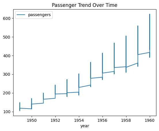
8. Creating a Time Series Trend Plot
Visualizing trends over time is crucial for time series data. This one-liner creates a plot showing how passenger numbers changed over years.
flights.plot(x='year', y='passengers', figsize=(12, 6), title="Passenger Trend Over Time")
The output is a line plot showing the trend of passengers over time.
9. Calculating Period-over-Period Changes
This one-liner calculates the percentage change from the previous period, allowing you to understand growth rates.
flights.assign(pct_change=flights['passengers'].pct_change() * 100)
Output:
 	year 	month 	passengers 	pct_change
0 	1949 	Jan 	112 	NaN
1 	1949 	Feb 	118 	5.357143
2 	1949 	Mar 	132 	11.864407
3 	1949 	Apr 	129 	-2.272727
4 	1949 	May 	121 	-6.201550
... 	... 	... 	... 	...
139 	1960 	Aug 	606 	-2.572347
140 	1960 	Sep 	508 	-16.171617
141 	1960 	Oct 	461 	-9.251969
142 	1960 	Nov 	390 	-15.401302
143 	1960 	Dec 	432 	10.769231

144 rows × 4 columns
This shows the month-over-month percentage change in passenger numbers.
10. Creating a Seasonal Decomposition
This one-liner transforms the data into a matrix format with years as rows and months as columns, then creates a visualization showing seasonal patterns across years.
flights.pivot(index='year', columns="month", values="passengers").plot(figsize=(14, 8), title="Monthly Passenger Counts by Year")
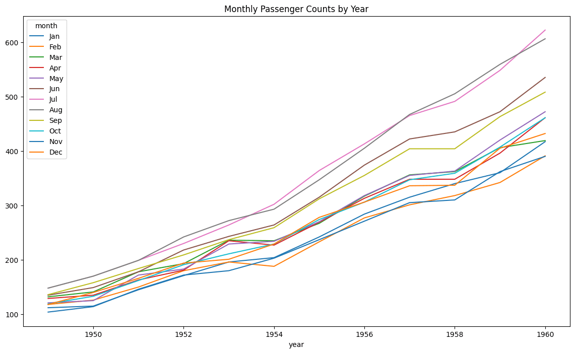
This gives a line plot showing passenger counts by month for each year, revealing seasonal patterns.
Wrapping Up
These 10 pandas one-liners show how you can use pandas for exploratory data analysis. By combining these techniques, you can quickly gain insights into any dataset’s structure, contents, and patterns.
Happy data analysis!
Bala Priya C is a developer and technical writer from India. She likes working at the intersection of math, programming, data science, and content creation. Her areas of interest and expertise include DevOps, data science, and natural language processing. She enjoys reading, writing, coding, and coffee! Currently, she’s working on learning and sharing her knowledge with the developer community by authoring tutorials, how-to guides, opinion pieces, and more. Bala also creates engaging resource overviews and coding tutorials.