When crafting stunning websites, like the ones showcased in Codrops roundups, it’s equally important to test how your site works and how it looks. A tremendous amount of effort goes into building polished interfaces and ensuring a seamless user experience, but even the most beautifully designed sites can be marred by visual bugs and inconsistencies.
Functional tests, such as end-to-end or unit tests, are fantastic at verifying the logic and behavior of your web pages, but they’re unable to catch bugs in UI appearance. That’s because functional tests don’t actually “see” the pixels rendered by your UI.
For example, buggy CSS might cause the “checkout” button to be obscured by a banner. Your functional test will indicate that the button remains clickable—since it technically is—even though users can’t actually access it.
In this article, I’ll show you how to resolve false positives and prevent rendering bugs from reaching production using a workflow called visual testing. You’ll learn how visual testing works and how to implement it using Playwright and Chromatic.
How does visual testing work?
You can think of visual testing as “before-and-after” snapshots of your website. You begin by capturing a perfect “before” image—this becomes your baseline. After any code changes, you compare a new “after” snapshot pixel-by-pixel against the baseline, revealing any visual differences.
Visual testing tools, such as Chromatic, automate this process of snapshotting and running diff checks across the entire website UI.
Chromatic’s workflow involves four steps:
- Cloud Rendering: Chromatic renders your UI in a cloud-based browser.
- Snapshot Capture: Chromatic takes a snapshot for each test, with all tests running simultaneously to save you time.
- Automated diffing: Whenever you update your code, Chromatic generates new snapshots and compares them to the baselines.
- Review and Verification: When Chromatic detects changes, you’re prompted to review them to ensure they’re intentional. Any unexpected changes trigger notifications so you can fix them quickly.
Let’s see this technique in action with a demo. I’m going to test the UI from the “Dynamic Tooltip Reveal Animations” article. The site features a grid layout with various elements. And notice how hovering over the links in the main content triggers animated tooltips.
Follow along with the project by grabbing the code here:
$ npx degit winkerVSbecks/PixelGooeyTooltip#starting-point PixelGooeyTooltip
$ cd PixelGooeyTooltip
$ npm install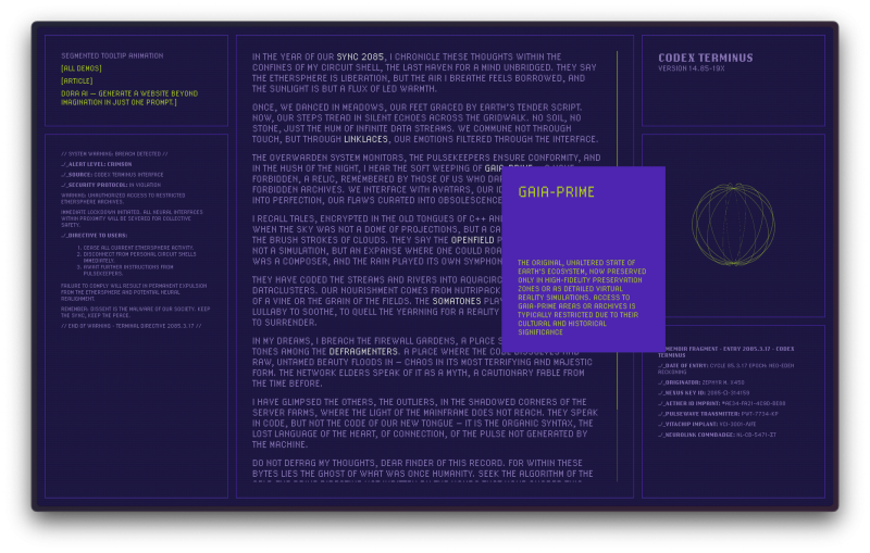
How do Chromatic and Playwright integrate for visual testing?
Chromatic seamlessly integrates with popular testing tools like Storybook, Playwright, and Cypress. While Storybook is ideal for component-based websites, we’ll leverage Chromatic’s Playwright integration to perform visual tests on this static HTML page.
Playwright is an open-source tool that automates end-to-end (E2E) testing by simulating user interactions like clicks, hovers, and typing directly in the browser.

While Playwright tests run, Chromatic works behind the scenes, capturing an archive of each page, including its DOM, styling, and assets. This archive is then uploaded to the cloud, where Chromatic generates snapshots and performs pixel-by-pixel comparisons to to identify any unintended visual changes.
Workflow
We’ll break this workflow into two parts. First, we’ll set up Playwright and write E2E tests to trigger the tooltip. Then, we’ll use Chromatic to transform those E2E tests into visual tests.
Setup Playwright
Run the following command to setup Playwright:
$ npm init playwright@latestThis will add Playwright to your package.json, generate a playwright.config.js file, and create a tests folder with a basic example. You will also get a tests-examples folder with a more detailed example.
Write your first E2E test
Rename tests/example.spec.js to tests/segmented-tooltip.spec.js and update its contents as follows:
// tests/segmented-tooltip.spec.js

const { test, expect } = require('@playwright/test');

test('has title', async ({ page }) => {
  await page.goto('http://127.0.0.1:8080');
  await expect(page).toHaveTitle(/Segmented Tooltip Animation/);
});
Run npx http-server . to serve the website on a local development server. Then run the Playwright tests using:
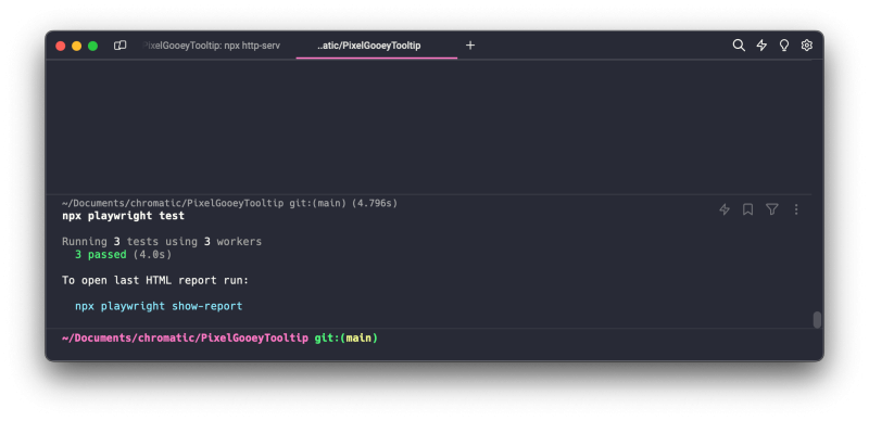
$ npx playwright testYou should see the results of the tests in the terminal. You’ll notice three tests in the output. This is because, by default, Playwright runs each test in Chromium, WebKit, and Firefox.
Test hover tooltips
The first test verifies the website’s title. Let’s expand our test suite by adding a second test that locates and activates one of the hover tooltips. The tooltip animates in, so the assertion checks that the tooltip content is visible at the end of the animation.
// tests/segmented-tooltip.spec.js

const { test, expect } = require('@playwright/test');

test('has title', async ({ page }) => {
  await page.goto('http://127.0.0.1:8080');
  await expect(page).toHaveTitle(/Segmented Tooltip Animation/);
});

test('displays tooltip', async ({ page }) => {
  await page.goto('http://127.0.0.1:8080');
  await page.locator('css=.trigger').first().hover({ force: true });
  await expect(
    page.locator('css=#tooltip-1 .tooltip__content-desc.glitch')
  ).toHaveCSS('opacity', '1');
});
This time let’s run these tests in UI Mode to actually see how these tests run in the browser.
$ npx playwright test --ui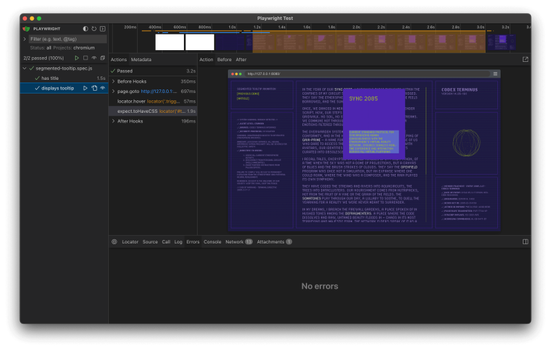
Exciting! Our E2E tests are up and running. Now, let’s see how we can use them for visual testing.
Sign up and create a new project
Sign up for a free Chromatic account using your GitHub, GitLab, Bitbucket account, or email. You’ll receive 5,000 free snapshots per month.
Then click Add project and follow the prompts to create a new Playwright project. Finally, copy the unique token for your project. Like so:
Add Chromatic to Playwright tests
Install Chromatic related packages:
$ npm install -D chromatic @chromatic-com/playwrightThen, swap the Playwright testing utilities with those from @chromatic-com/playwright. That’s it, by changing just one line of code we can convert these E2E tests into visual tests.
// tests/segmented-tooltip.spec.js

// ➖ Remove this line
// import { test, expect } from '@playwright/test';
// ➕ Add this line
import { test, expect } from "@chromatic-com/playwright";

test('has title', async ({ page }) => {
  await page.goto('http://127.0.0.1:8080');
  await expect(page).toHaveTitle(/Segmented Tooltip Animation/);
});

test('displays tooltip', async ({ page }) => {
  await page.goto('http://127.0.0.1:8080');
  await page.locator('css=.trigger').first().hover({ force: true });
  await expect(
    page.locator('css=#tooltip-1 .tooltip__content-desc.glitch')
  ).toHaveCSS('opacity', '1');
});
Run visual tests
Run your Playwright tests as you normally would. While your Playwright tests are running, Chromatic captures an archive of the webpage for each test.
$ npx playwright testThen, use your project token and run the following command in your project directory. Chromatic will then upload the archive to it’s cloud infrastructure and execute the visual tests.
$ npx chromatic --playwright -t=<TOKEN>After the Chromatic command completes, you’ll receive a confirmation that the tests ran successfully. Since this was the first run, baselines have now been established for these tests.
✔ Started build 1
  → Continue setup at https://www.chromatic.com/setup?appId=...
✔ Build 1 auto-accepted
  → Tested 2 stories across 2 components; captured 2 snapshots in 17 seconds
Catch visual changes
With our baselines established, Chromatic will catch any visual changes made to this UI. Let’s give it a go. We’ll modify the tooltip background and text colors in the tooltip.css file.
/* css/tooltip.css */

.tooltip {
    --tt-width: 200px;
	--tt-height: 250px;
	--tt-columns: 3;
	--tt-rows: 4;
	--tt-bg-color: #FF6B6C; /* 👈 this one */
	--tt-text-color: #000; /* 👈 and this one */

  /* ... */
Run the tests again:
# First Playwright
$ npx playwright test
# Then Chromatic
$ npx chromatic --playwright -t=<TOKEN>
Chromatic will now provide a summary of changes. Click the link to review the changes.
✖ Found 1 visual change: Review the changes at https://www.chromatic.com/build?appId=...&number=3The build will be marked “unreviewed” and the changes will be listed in the “Tests” table. In our case, the “displays tooltip” test has a change.
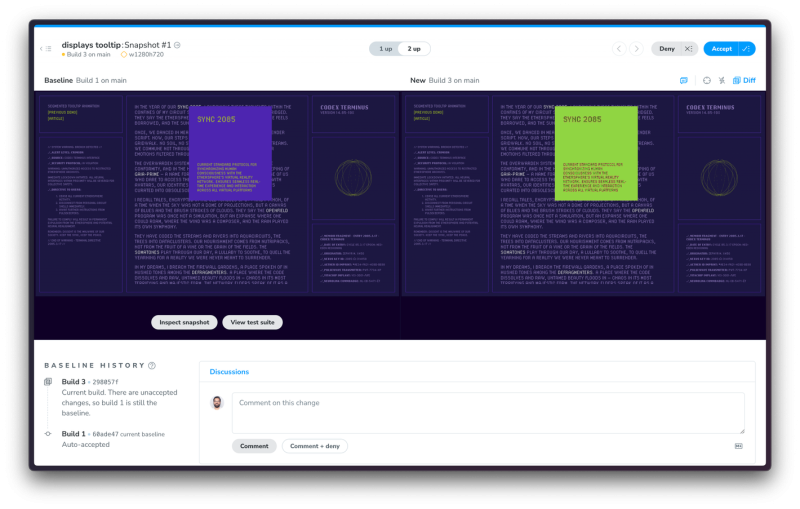
The idea is to review these changes to verify whether they’re are intentional or erroneous. Once you accept all changes, your build is marked as passed 🟢. This also updates the baselines for these tests, ensuring future snapshots are compared against the latest approved version.
Visual test responsive design
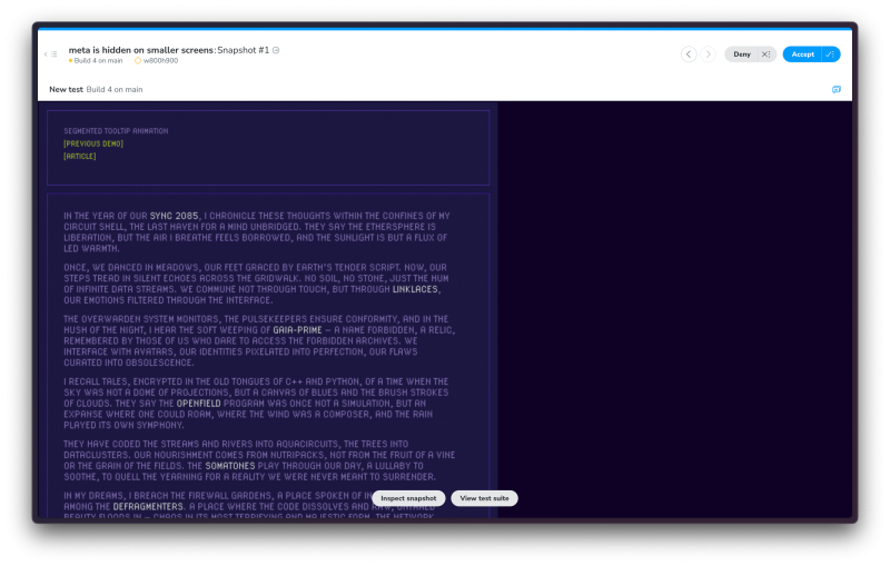
We’ve got the core visual testing workflow down. However, there’s one more aspect to consider: at smaller viewport sizes, certain UI elements are hidden. We need to account for this scenario into our tests.
Leveraging Playwright’s viewport emulation feature, we can simulate different screen sizes and capture snapshots across various viewports.
// tests/segmented-tooltip.spec.js

// ...

test.use({
  viewport: { width: 800, height: 900 },
});

test('meta is hidden on smaller screens', async ({ page }) => {
  await page.goto('http://127.0.0.1:8080');
  for (const meta of await page.locator('css=.meta').all())
    await await expect(meta).toBeHidden;
});
By re-running our tests, Chromatic will snapshot the site at smaller viewport size, enabling us to verify the small screen layout.
Levelling up your visual testing
In this post, we explored the fundamentals of visual testing using Playwright and Chromatic, but there’s much more to discover!
To truly elevate your testing game, consider integrating Chromatic into your CI pipeline. That way you’re notified of any visual changes introduced by a pull request, ensuring your UI remains pixel-perfect.
Chromatic also lets you fine-tune snapshot capture by adding a delay before the snapshot, adjusting the diff threshold, or capturing multiple snapshots at specific points during a test. To learn more about Chromatic’s features, check out the documentation. And the code for this demo is available here: https://github.com/winkerVSbecks/PixelGooeyTooltip
