
Creating something for yourself is always a special experience. Our previous portfolio had been around for years, and we wanted to craft a new one that truly reflects the agency’s evolving values. Originally published in 2021, our old portfolio no longer aligned with our identity. It was clear that the time had come for a fresh start.
We set out to create an experience that is both distinctive and enjoyable, while ensuring optimized performance. At the same time, we remained mindful of today’s environmental challenges, aiming to create a lightweight and optimized website for faster loading times and a reduced environmental impact.
Let’s dive in and explore the vision and design choices behind our new portfolio.
Design Process
Concept
The main objective for the new website was to create a lightweight yet memorable experience. The challenge was to strike a balance between a strong and identifiable user interface while maintaining high performances and optimizations to ensure a fast and lightweight website.
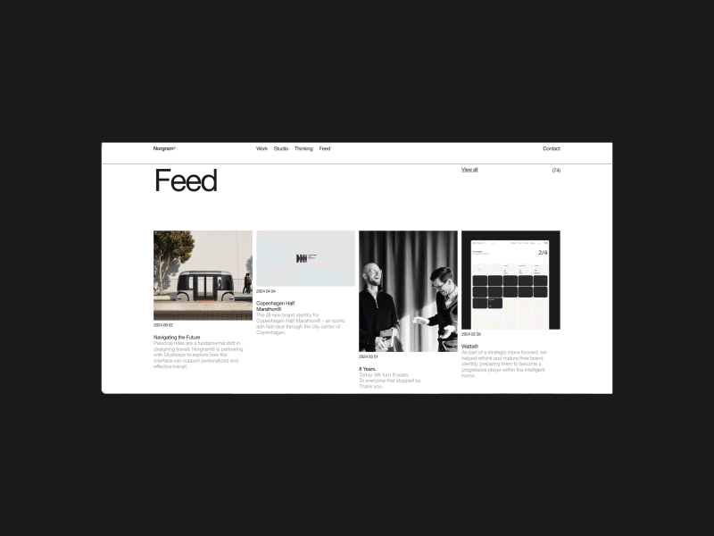
The focus was to highlight our projects and expertise, putting content at the forefront. Our previous portfolio was outdated in every aspect, and we wanted to bring something more sustainable and timeless.
Another key challenge was to create a clean and engaging design while also being environmentally responsible, making strong decisions on both the UI and development sides.
Once all these ideas were set, it was time to explore design inspirations that aligned with our goals and start crafting the UI.
Grid
All elements are structured within a 24-based grid. The idea was to introduce subtle shifts inside our blocks library to create rhythm and avoid the monotony of repetition.
Types & Colors
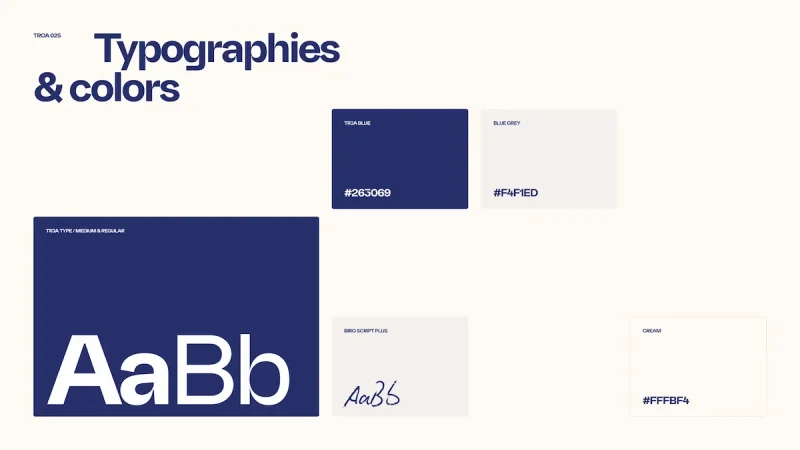
We choice to mix sans-serif and handwritten typefaces to create a balanced and engaging visual identity. Our sans-serif typeface, “Tr3a”, comes in two weights, allowing us to establish a clear and bold hierarchy between elements.
To add a more human and personal touch, we incorporated a handwritten typeface for annotations, enhancing the overall experience with a sense of warmth and authenticity.
We opted for a subtle use of our colors to enhance and give space to the visuals. Therefore, we used only our navy blue and a slightly creamy color. These color choices provide strong contrast, ensuring high readability and enhanced accessibility. We deliberately chose a cream color instead of pure white to help reduce screen energy consumption while maintaining a soft and comfortable visual experience.
Visuals
The color palette and design spacing allow the visual elements to pop and stand out. With a mix of our latest productions and photographs taken at the agency, we aim to create a more authentic that reflects our creative vision and identity.
We wanted to highlight the people behind our projects and showcase their expertise. This is reflected, for example, on the homepage, where the hero visual changes randomly to feature different team members.
Motion
One of the core challenge of this new version was to rethink and question the fundamental purpose of interactions. The previous version of our portfolio was filled with interactions, animations, and visual effects that no longer aligned with our vision of making each motion element meaningful and reinforcing the brand identity.
Development Choices
Tech Stack
Here’s a quick overview of our tech stack and the key technical choices we made for this website:
The entire website is built on top of the Kirby CMS, known for its flexibility and efficiency. It provides a highly optimized experience for both developers and end users. It is a PHP-based CMS, which we use alongside Twig to enhance the developer experience.
JavaScript and animations handling
As we mentioned earlier, one of the key principles was to deliver a seamless experience while maximizing performance.
Our JavaScript architecture is built on the latest beta version of Locomotive Scroll (v5), developed by Locomotive. It features module management with Modular.js and scroll-driven animations with Lenis. We also use Barba.js for ajax page transitions and loaders.
To ensure the smallest possible JavaScript bundle size, we deliberately chose not to use animation engines like Anime.js or GSAP, relying solely on CSS animations instead. CSS is incredibly powerful and often underestimated when it comes to animations.
For the CSS, we opted for a mix of inline and file-based styles. To minimize layout shifts and maintain good loading performance, we decided to include critical CSS directly in our HTML files. Internally, we use the BEM methodology for writing our CSS rules and our architecture is a hybrid between the classic 7-1 structure and the atomic design approach.
Additionally, to reduce the final CSS file size, we use PurgeCSS, which parses all templates and removes unused CSS rules. This is especially useful for eliminating unnecessary grid columns and offsets, significantly reducing the final stylesheet size.
All JavaScript and CSS are managed by Vite.js, which handles asset processing and delivers the final bundled files.
Performances and environmental impact
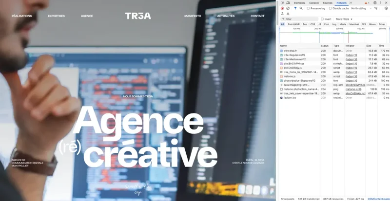
Coupled with efficient caching rules, request reduction, and various optimizations (fonts, images, styles, etc.), all these efforts allowed us to achieve a significantly lighter final page weight. The homepage weighs only 500 KB on initial load with just 12 HTTP requests. The entire bundled JavaScript file is under 30 KB (28.7 KB), while the CSS remains under 8 KB (7.8 KB).
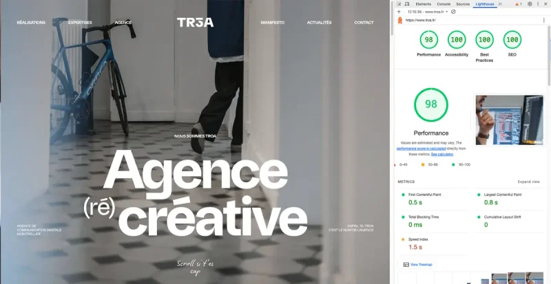
Beyond performance optimizations, we also paid close attention to the environmental impact of our website. Thanks to our lightweight architecture and efficient resource management, we achieved a B rating on EcoIndex and an A rating on Website Carbon, with a footprint of just 0.13g of CO₂ per visit, significantly lower than the web average of 1.76g. Additionally, our green hosting plays a key role in reducing our carbon footprint, as it relies on renewable energy solutions to power our infrastructure. These choices reflect our commitment to building a high-performance and environmentally responsible website.
Conclusion
Embracing eco-friendly choices doesn’t mean sacrificing interface quality or user experience. On the contrary, it fosters a more thoughtful and intentional approach to design—one that not only minimizes environmental impact but also enhances usability, efficiency, and overall engagement. By prioritizing sustainability, we create digital experiences that are both responsible and refined.
We hope this case gives you some insight into how we can improve our future projects.
Credits
Strategy: Brice Martinez, Mathieu Martin
SEO: Justine Menu, Mathieu Martin
Art direction & Design: Brice Martinez
Photography: Bastien Seon
Typography : Romain Oudin
Development: Romain Breton, Antoine Cantoro, Cyrielle Vuillemin, Leonardo Pedroza Hernandez
Revision: Clara Boroniowna, Louise Ellermann
Hosting: Julien Corbiere