Subtle and visually appealing effects on the web can significantly enhance user experience and engagement. In this tutorial, we’ll guide you through the process of crafting a glowing SVG text coupled with a marquee effect, using only HTML, CSS, and the clip-path property.
You can see this effect in action on the website of Darkroom by Kaploom ® Creative House, the award-winning design membership service.
In this tutorial, we’ll look at how to prepare the design assets in Figma and use the SVGs together with CSS to create the animation. This will be the final result:
So, let’s get started!
Assets
For our assets we’ll need 3 things:
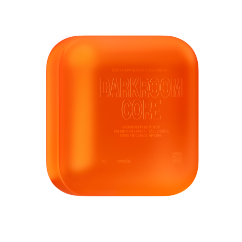
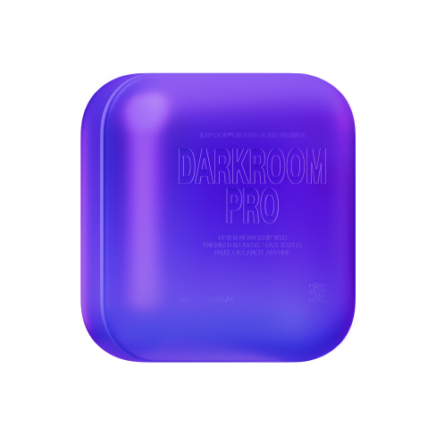
- Images we’ll use for the glow effect
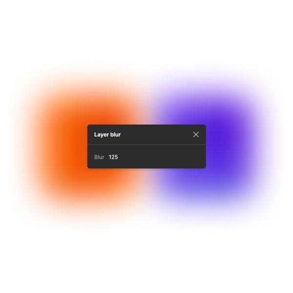
- Blurred versions of these images to maintain the shape of the glow
- Our title in an SVG format
Images
Be sure to export the images in a format that supports transparency (PNG, WEBP, AVIF, etc.)


The Blur
Now in Figma, add a “Layer blur” to each image and export them separately. We can export them in a relatively small resolution (50px width) since the browser image rendering will blur our images by default.

Preparing the SVG title
Our SVG title will be used in a marquee effect, which we call a “Rail”. In this case, we’ll need at least one duplicate of the title so it covers the whole screen at all times.
Don’t worry about the colors at this step, since we’ll apply them though code and by using our previously exported blurred images.

It’s important to make sure the spacing between the title and the duplicate matches the end frame spacing so that later on, we get a smooth marquee effect without any unexpected jumps.

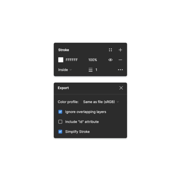
When exporting the SVG from Figma, apply a border to the title and check the “Simplify Stroke” box under export settings.

Converting the Path
Now that we have our SVG we need to convert the path from userSpaceOnUse to objectBoundingBox. We can do that using this online converter.
<svg width="1137" height="104" viewBox="0 0 1137 104" fill="none" xmlns="http://www.w3.org/2000/svg">
    <path d="M13.2057 88.8793V89.3793H13.7057H30.9417C40.7369 89.3793 48.6776 81.4387..." fill="white" stroke="white"/>
</svg>
Here’s how our objectBoundingBox path should look:
M0.012,0.867 V0.872 H0.012 H0.027 C0.036,0.872,0.043,0.794,0.043,0.699 V0.314 C0.043,0.218,0.036,0.141,0.027,0.141 H0.012 H0.012 V0.146...Creating the Rail
For this component, we’ll need the blurred image assets we just exported and our objectBoundingBox path which we’ll use for our SVG mask.
Here is the basic structure of our Rail component:
<div class="rail">
	<div class="rail_container">
	  <div class="rail_clip">
		<div class="rail_color">
		  <div class="rail_gradients">

			 /* Blurred images go here */
			  <img
				src="img/gradient-core.png"
				width="50"
				height="50"
				alt="Core Gradient"
				class="rail_gradient -core"
			  />
			  <img
				src="img/gradient-pro.png"
				width="50"
				height="50"
				alt="Pro Gradient"
				class="rail_gradient -pro"
			  />

		  </div>
		</div>
	  </div>

	   /* Rail sizing used for precise aspect ratio */
	  <svg
		width="1137"
		height="104"
		viewBox="0 0 1137 104"
		fill="none"
		xmlns="http://www.w3.org/2000/svg"
		class="rail_sizing"
	  ></svg>

	  /* SVG Mask */
	  <svg class="rail_mask">
		<clipPath id="contentTitle" clipPathUnits="objectBoundingBox">
		  <path
			d="M0.012,0.86 V0.861 H0.012 H0.027 C0.036,0.861,0.042,0.786,0.042,0.693 V0.311 C0.042,0.219,0.036,0.144,0.027,0.144 H0.012 H0.012 V0.145 V0.86 M0.13,0.524 H0.13 V0.525 V0.583 V0.584 L0.13,0.584 L0.167,0.992 H0.15 L0.13,0.77 L0.13,0.769 V0.771 V0.992 H0.118 V0.013 L0.139,0.013 C0.152,0.013,0.162,0.127,0.162,0.268 C0.162,0.409,0.152,0.524,0.139,0.524 H0.13 M0.13,0.144 H0.13 V0.145 V0.392 V0.393 H0.13 L0.139,0.393 C0.145,0.393,0.15,0.337,0.15,0.268 C0.15,0.199,0.145,0.144,0.139,0.144 L0.13,0.144 M0.213,0.013 H0.228 L0.198,0.502 L0.198,0.502 L0.198,0.503 L0.228,0.992 H0.213 L0.188,0.568 L0.188,0.568 H0.188 H0.183 H0.183 V0.569 V0.992 L0.171,0.992 V0.013 L0.183,0.013 V0.436 V0.437 H0.183 H0.188 H0.188 L0.188,0.437 L0.213,0.013 M0.07,0.807 H0.07 L0.07,0.808 L0.067,0.992 H0.055 L0.072,0.013 H0.097 L0.114,0.992 H0.102 L0.099,0.808 L0.099,0.807 H0.099 H0.07 M0.072,0.675 L0.072,0.676 H0.072 H0.096 H0.097 L0.096,0.675 L0.087,0.144 L0.087,0.144 H0.087 H0.082 H0.082 L0.082,0.144 L0.072,0.675 M0.054,0.693 C0.054,0.858,0.042,0.992,0.027,0.992 H0 V0.013 H0.027 C0.042,0.013,0.054,0.147,0.054,0.311 V0.693 M0.512,0.86 V0.861 H0.512 H0.527 C0.536,0.861,0.542,0.786,0.542,0.693 V0.311 C0.542,0.219,0.536,0.144,0.527,0.144 H0.512 H0.512 V0.145 V0.86 M0.63,0.524 H0.63 V0.525 V0.583 V0.584 L0.63,0.584 L0.667,0.992 H0.65 L0.63,0.77 L0.63,0.769 V0.771 V0.992 H0.618 V0.013 L0.639,0.013 C0.652,0.013,0.662,0.127,0.662,0.268 C0.662,0.409,0.652,0.524,0.639,0.524 H0.63 M0.63,0.144 H0.63 V0.145 V0.392 V0.393 H0.63 L0.639,0.393 C0.645,0.393,0.65,0.337,0.65,0.268 C0.65,0.199,0.645,0.144,0.639,0.144 L0.63,0.144 M0.713,0.013 H0.728 L0.698,0.502 L0.698,0.502 L0.698,0.503 L0.728,0.992 H0.713 L0.688,0.568 L0.688,0.568 H0.688 H0.683 H0.683 V0.569 V0.992 L0.671,0.992 V0.013 L0.683,0.013 V0.436 V0.437 H0.683 H0.688 H0.688 L0.688,0.437 L0.713,0.013 M0.57,0.807 H0.57 L0.57,0.808 L0.567,0.992 H0.555 L0.572,0.013 H0.597 L0.614,0.992 H0.602 L0.599,0.808 L0.599,0.807 H0.599 H0.57 M0.572,0.675 L0.572,0.676 H0.573 H0.596 H0.597 L0.597,0.675 L0.587,0.144 L0.587,0.144 H0.587 H0.582 H0.582 L0.582,0.144 L0.572,0.675 M0.554,0.693 C0.554,0.858,0.542,0.992,0.527,0.992 H0.5 V0.013 H0.527 C0.542,0.013,0.554,0.147,0.554,0.311 V0.693 M0.243,0.524 H0.243 V0.525 V0.583 V0.584 L0.243,0.584 L0.28,0.992 H0.263 L0.243,0.77 L0.243,0.769 V0.771 V0.992 H0.231 V0.013 L0.252,0.013 C0.265,0.013,0.275,0.127,0.275,0.268 C0.275,0.409,0.265,0.524,0.252,0.524 H0.243 M0.243,0.144 H0.243 V0.145 V0.392 V0.393 H0.243 L0.252,0.393 C0.258,0.393,0.263,0.337,0.263,0.268 C0.263,0.199,0.258,0.144,0.252,0.144 L0.243,0.144 M0.455,0.013 H0.478 V0.992 H0.466 V0.145 V0.144 H0.466 H0.465 H0.465 L0.465,0.145 L0.45,0.992 H0.428 L0.414,0.145 L0.414,0.144 H0.414 H0.413 H0.413 V0.145 V0.992 H0.401 V0.013 H0.424 L0.438,0.86 L0.438,0.861 H0.438 H0.44 H0.44 L0.44,0.86 L0.455,0.013 M0.383,0.701 V0.305 C0.383,0.211,0.376,0.134,0.367,0.134 C0.359,0.134,0.352,0.211,0.352,0.305 V0.701 C0.352,0.795,0.359,0.872,0.367,0.872 C0.376,0.872,0.383,0.795,0.383,0.701 M0.34,0.305 C0.34,0.138,0.352,0.003,0.367,0.003 C0.383,0.003,0.395,0.138,0.395,0.305 V0.701 C0.395,0.868,0.383,1,0.367,1 C0.352,1,0.34,0.868,0.34,0.701 V0.305 M0.323,0.701 V0.305 C0.323,0.211,0.316,0.134,0.307,0.134 C0.299,0.134,0.292,0.211,0.292,0.305 V0.701 C0.292,0.795,0.299,0.872,0.307,0.872 C0.316,0.872,0.323,0.795,0.323,0.701 M0.28,0.305 C0.28,0.138,0.292,0.003,0.307,0.003 C0.322,0.003,0.335,0.138,0.335,0.305 V0.701 C0.335,0.868,0.322,1,0.307,1 C0.292,1,0.28,0.868,0.28,0.701 V0.305 M0.743,0.524 H0.743 V0.525 V0.583 V0.584 L0.743,0.584 L0.78,0.992 H0.763 L0.743,0.77 L0.743,0.769 V0.771 V0.992 H0.731 V0.013 L0.752,0.013 C0.765,0.013,0.775,0.127,0.775,0.268 C0.775,0.409,0.765,0.524,0.752,0.524 H0.743 M0.743,0.144 H0.743 V0.145 V0.392 V0.393 H0.743 L0.752,0.393 C0.758,0.393,0.763,0.337,0.763,0.268 C0.763,0.199,0.758,0.144,0.752,0.144 L0.743,0.144 M0.955,0.013 H0.978 V0.992 H0.966 V0.145 V0.144 H0.966 H0.965 H0.965 L0.965,0.145 L0.95,0.992 H0.928 L0.914,0.145 L0.914,0.144 H0.914 H0.913 H0.913 V0.145 V0.992 H0.901 V0.013 H0.924 L0.938,0.86 L0.938,0.861 H0.938 H0.94 H0.94 L0.94,0.86 L0.955,0.013 M0.883,0.701 V0.305 C0.883,0.211,0.876,0.134,0.867,0.134 C0.859,0.134,0.852,0.211,0.852,0.305 V0.701 C0.852,0.795,0.859,0.872,0.867,0.872 C0.876,0.872,0.883,0.795,0.883,0.701 M0.84,0.305 C0.84,0.138,0.852,0.003,0.867,0.003 C0.883,0.003,0.895,0.138,0.895,0.305 V0.701 C0.895,0.868,0.883,1,0.867,1 C0.852,1,0.84,0.868,0.84,0.701 V0.305 M0.823,0.701 V0.305 C0.823,0.211,0.816,0.134,0.807,0.134 C0.799,0.134,0.792,0.211,0.792,0.305 V0.701 C0.792,0.795,0.799,0.872,0.807,0.872 C0.816,0.872,0.823,0.795,0.823,0.701 M0.78,0.305 C0.78,0.138,0.792,0.003,0.807,0.003 C0.822,0.003,0.835,0.138,0.835,0.305 V0.701 C0.835,0.868,0.822,1,0.807,1 C0.792,1,0.78,0.868,0.78,0.701 V0.305 M1,1 L1,1 H1 V1"
		  ></path>
		</clipPath>
	  </svg>

	</div>
</div>
Mask, Sizing and Animation
For the Rail mask, we’ll use the CSS clip-path property with and ID and apply it to the .rail_clip class.
.rail_clip {
    position: absolute;
    inset: 0;
    display: flex;
    justify-content: center;
    align-items: center;
    width: 100%;
    height: 100%;
    -webkit-clip-path: url("#contentTitle");
    clip-path: url("#contentTitle");
}
To make sure the <strong>clip-path</strong> keeps the correct aspect ratio we added <strong>.rail_sizing</strong> with its position set to relative. It will also determine the overall size of our Rail component.
.rail_sizing {
	position: relative;
	opacity: 0;
	height: auto;
	width: 200vw;
}
For the marquee effect, use a simple CSS animation that loops infinitely. The speed will depend on your SVG’s width and the length of the CSS animation.
.rail_clip {
  animation: clip-anim 20s linear infinite;
}

@keyframes clip-anim {
	from {
		transform: translateX(0%);
   }
	to {
		transform: translateX(-50%);
   }
}
Color and Gradients
Now for the fun part – colors!
First, apply a background color to the .rail_color class to ensure the title is visible even without gradients.
.rail_color {
	position: absolute;
	inset: 0;
	height: 100%;
	width: 100%;
	background-color: #0c0c0e;
}
Now since we’re animating the whole .rail_clip, with .rail_color being its child element, you’ll notice the background color is animating out of view… We want it to stand still!
So what need to do is animate the .rail_color in the opposite direction like so:
.rail_color {
	animation: color-anim 20s linear infinite;
}

@keyframes color-anim {
    from {
        transform: translateX(0%);
   }
    to {
        transform: translateX(50%);
   }
}
With that out of the way, we can add our blurred images inside the .rail_color div and align them to where we need them to be!
Accessibility
Last, but certainly not least… let’s add the title text for screen readers at the top of our Rail component and style it accordingly!
<div class="rail">
	<div class="screen-reader-text">DARKROOM</div>
	<div class="rail_container">
	  ...
	</div>
</div>
.screen-reader-text {
position: absolute !important;
overflow: hidden;
clip: rect(0 0 0 0);
margin: 0;
padding: 0;
width: 1px;
height: 1px;
border: 0;
}Finishing up
All that’s left to do now is add our main image assets over the Rail component, align them with our masked gradients, and add a little floating animation to each of the boxes.
@keyframes float-core {
    from {
        transform: translateY(0%);
   }
    to {
        transform: translateY(5%);
   }
}

@keyframes float-pro {
    from {
        transform: translateY(4%);
   }
    to {
        transform: translateY(0%);
   }
}
For an even better blending with our Rail component, we added a slight glow behind each box using the same blurred images with no clip-mask this time, but with the opacity turned way down.
It’s subtle but it adds a lot!
Check out the full demo with an added intro animation!
And if you want to see the full site in action – visit Darkroom!


