I’m an Independent Visual & Interactive Designer based in Barcelona, working globally. With a background in graphic design, I’m enthusiastic about typography, motion and web-based animations. With experience working with talented teams and individuals, I specialize in translating brands into unique and immersive digital user experiences.
My works and explorations have different recognitions which allowed me to join as a member of the Jury at Awwwards, judging the best of the web since 2020. Some projects have been also recognized with Honorable Mentions and SOTD on Awwwards, FOTD on FWA, WOTD on CSS Design Award, Gold and Silver Laus prize by ADGFAD, Features on Behance and highlights on different platforms.
I also love to participate in lectures and talks at design universities in Barcelona, such as Elisava University, where I’ve been collaborating as an associate professor in some postgraduate courses. I have also produced an online course on Domestika called “Designing an Interactive Web with Figma”, and I regularly take part in conferences at design events and festivals as Latent Fest in Barcelona and Awwwards Conference Design Leaders in Valencia.
Featured Work
Eva Sánchez Portfolio 2024
A captivating portfolio crafted to showcase my work as an Interactive Designer based in Barcelona. It features clean, grid-based layouts with innovative hover interactions inspired by fractal distortion. Developed with WebGL, MSDF, and CPU shaders, it offers a dynamic and engaging user experience. This portfolio serves as a creative and interactive showcase of my projects and career, helping me stand out in the digital sector.
Designing this portfolio was a challenge, but from the beginning, the focus was clear: typography had to take center stage. Inspired by fractal and liquid reflection concepts, we aimed for an editorial design with a unique twist, blending familiar elements into an immersive and cohesive experience. The result, crafted through collaborative discussions and tests with Ángel (the developer), features fractal deformation, blurred elements, and playful liquid fonts that surprise and define the site’s identity.
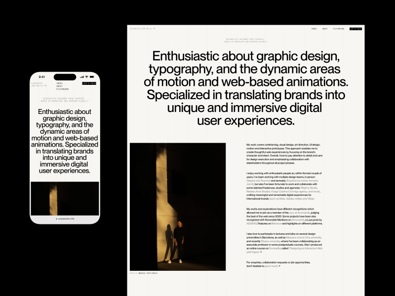
Banjo Soundscapes
Website environment for Banjo, a sound design studio based in Valencia. They present us with a concise brief: translate the new brand identity into a renewed portfolio site where both visuals and sounds hold equal importance.
The logo, which opens and closes, serves as a gateway to a land of silence, allowing users to explore, discover, and create music while exploring all the studio’s projects.
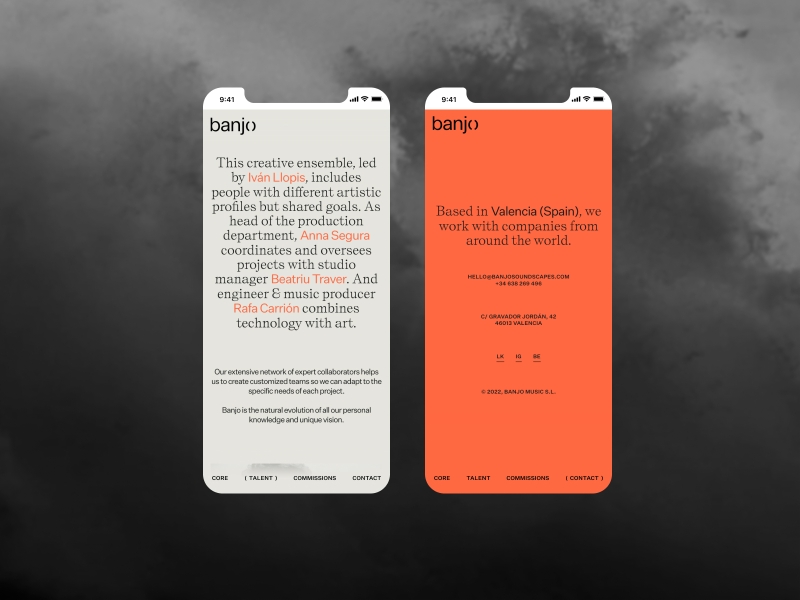
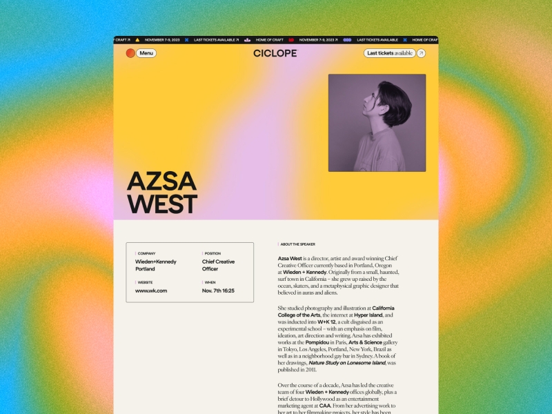
Ciclope Fest
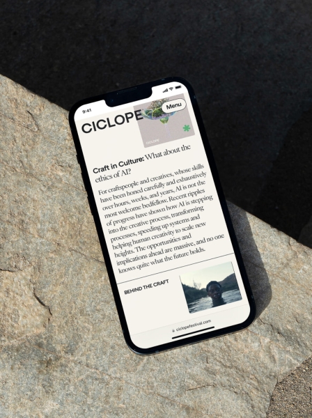
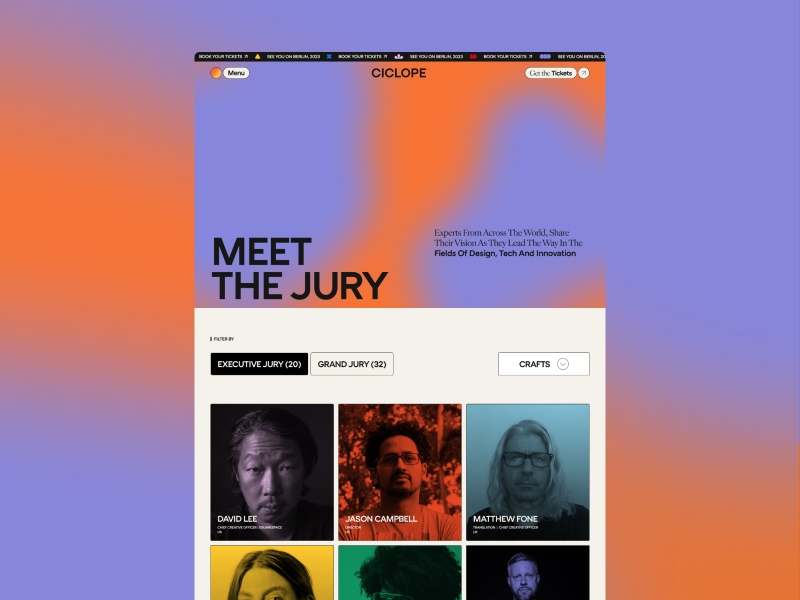
Ciclope Festival is a festival based in Berlin that showcases amazing works in music videos, short films and commercials. The goal was to create an interface with smooth interactions that complement the festival’s essence while keeping the visuals at the forefront. The result was a site with playful and interactive elements that provide a unique and engaging experience.
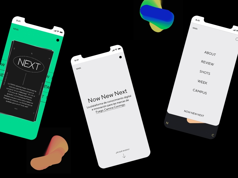
Now New Next Microsite
Now New Next is a digital platform for knowledge and innovation (with a strong divulgative character) that was born, after the pandemic, as an initiative of Fuego Camina Conmigo’s Agency, to connect differently with its brands.
They reached out to me to do the UX and support them in the interface and interaction design for the website, working alongside the talented creative team of the agency. The result was a colorful modular website, ready to adapt to future content and integrations, with little elements of surprise and playfulness for the user.
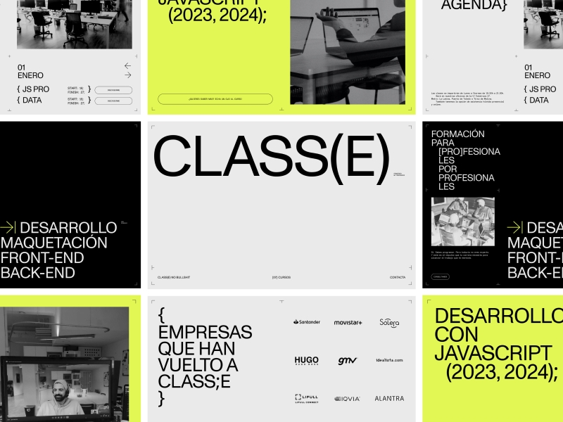
CLASS(E) Website
A code academy by developers for developers created by Redradix, a company with over (10)years of expertise in the industry. The goal was to design an original website that represents the school’s attitude while ensuring that its objectives aren’t overlooked: prioritizing a user experience that integrates both content and form while offering engaging interactions.
The result is a dynamic website full of details: micro-interactions, animations, horizontal scroll, mega menu, and a strong footer. A site that not only connects with its users but also translates their new identity into a dynamic digital space that speaks the coder’s language: grids, divs, and plenty of classes.
Kids Agency Portfolio Website
Digital environment for Kids Agency, a creative agency based in Valencia. We created a multipurpose portfolio space that showcases all their projects and services, while also allowing them to share content they generate such as their blog or Look’s page, a section where the agency can share content that inspire them and connect with its audience.
With all of these features, we created a fun and interactive site that effectively connects with the user, while also representing the playful attitude of the agency.
Background
I’m an Independent Visual & Interactive Designer based in Barcelona, working globally. Also Jury member at Awwwards, Speaker and Teacher at Domestika. With a background in graphic design, I’m enthusiastic about typography, motion and web-based animations. I specialized in translating brands into unique and immersive digital user experiences.
I’ve been freelancing for the past 5 years but since the beggining of 2024 I’m stablished as a full time freelancer working as interactive designer, focusing mainly on web design, interaction design and art direction for digital.
I enjoy working with enthusiastic people so, within the last couple of years, I’ve been working with multiple design teams, in person (Vasava and Toormix in Barcelona) and remotely (Experience.monks, formerly Jam3), but also I’ve been fortunate to work and collaborate with some talented freelances, studios and agencies as Réplica Studio, Rebeka Arce Studios, Feeld.co, Alex Hunting Studio, Hanzo, and more, crafting meaningful and remarkable digital experiences for international brands (such as Meta, Adidas, Inditex and Vibia).
Design Philosophy
The approach I bring to every project is rooted in communication and transparency. Building a foundation of trust is essential, regardless of the project’s budget. My priority in every new collaboration is to create a safe environment where all parties—whether developers, designers, or clients—feel confident and supported throughout the process. I believe that giving each stakeholder the space to contribute and express their creativity leads to the best outcomes. After years of freelancing, I’ve learned that a project’s success hinges on the trust established between the client and me. Without trust, good results are simply not possible.
Tools and Techniques
I use Figma for almost everything, from conceptualization to final design and interactive prototypes. I sometimes use Adobe Photoshop for visual treatments or mockups, and After Effects for motion design and Instagram content. ChatGPT also helps me create copy and set design and content guidelines. When it comes to management, using Notion is essential for me on a daily basis.
Inspiration
I often find inspiration when researching for my talks, classes, and conferences. I’ve realized that exploring the more theoretical and humanistic aspects of design really resonates with me. Interestingly, consuming content not directly related to design often proves to be more valuable, even if it’s less common. Also another good source of inspiration is talking with other people from the design field and sharing experiences. My Instagram feed is filled with design, motion, and art content, which can be a great source of inspiration, though it can sometimes feel overwhelming. I also find platforms like Are.na and Savee very helpful during my exploration phases.
Future Goals
Honestly, I’m focusing on finding a better balance between my professional and personal life, and I hope to achieve this in my second year as a freelancer. I love what I do, but I often find myself working from 9 AM to 9 PM, pushing aside personal plans and hobbies. As a freelancer, it’s easy to take on more projects than planned, either because an opportunity is too good to pass up or due to unexpected overlaps. On a project level, I’m eager to continue collaborating with design studios and learning from different teams. Freelancing may be a solo journey, but it offers the chance to meet and grow alongside other professionals.
Final Thoughts
Work with people who help you grow both as a person and as a designer. Choose collaborators with a supportive attitude, so if the project doesn’t go as planned, you’ll have a team to lean on. Also, find a ‘partner in crime’ with your developer; having a friend on that side can only enhance and elevate your design. Learn from your mistakes, and be there for those who need guidance. In design, some topics—like rates and money—can be seen as taboo, but being open about them can greatly help those just starting in the industry. In the end, remember that no one has it all figured out; we’re all just learning as we go.
