When building modern, creative websites, managing complex interactions and maintaining clean, modular code can be challenging. That’s where piecesjs comes in—a lightweight front-end framework designed to simplify the process of working with native web components. It provides the flexibility to manage components dynamically, without the heavy constraints of traditional frameworks.
At its core, a “Piece” is a modular component that can live anywhere on your webpage. Each Piece operates independently, with its own encapsulated styles and interactions, making it easy to manage and reuse across your site.
Piecesjs dynamically imports only the necessary JavaScript and CSS for each page, optimizing performance while maintaining flexibility. Unlike larger frameworks, it allows you to build exactly what you need, free from the overhead of unnecessary code or restrictive architectures.
Designed for creative websites that rely heavily on JavaScript logic—handling multiple steps, states, and events—piecesjs offers a streamlined and scalable approach for developers looking to create highly interactive experiences.
The project is built using Vite, providing fast compilation and easy asset imports, including CSS through postCSS (with a valid postCSS configuration).
The first lines of piecesjs code were written in March 2024.
If you’d like to explore the repository before we dive in, you can find it here:
GitHub: https://github.com/piecesjs/piecesjs
Main Features
- Dynamic JS & CSS Import: Automatically loads only the necessary JavaScript and CSS for each page, improving performance.
- Scoped Event Management: Easily manage events within a specific component’s scope using
this.on()andthis.off()methods. - Convenient Access to Scoped HTMLElements: Quickly access elements within the component using
this.$()orthis.domAttr('slug'). - Seamless Communication Between Active Components: Components can communicate effortlessly with each other using
this.call()orthis.emit(). - Efficient Global CSS Management: Streamlined handling of global CSS imports to keep your styles organized.
- PiecesManager: Provides centralized access to all active pieces, simplifying component management.
Why I Created piecesjs
As a former front-end lead and creative developer at Locomotive, we prioritized establishing shared workflows among developers. Our goal was to create a cohesive unit, facilitating seamless project transitions and inter-developer support. Locomotive has always been committed to sharing its methodologies, whether through diverse front-end and back-end boilerplates or tools like locomotive-scroll. It felt natural for me to continue building my own tools, improving them, and sharing them with others.
At the start of my freelance career, I was still using the locomotive-front-end-boilerplate, which relied on modularjs. I wanted to create something more modern, with dynamic imports that load only the necessary code while preserving key concepts.
I’m not a big fan of large modern frameworks for various reasons. When I develop a workflow, I like to evolve and adapt it to new standards and technologies. Whether working solo or in a team, I’ve always found it rewarding to develop our own tools (like locomotive-scroll) and share them.
On Which Infrastructure Does piecesjs Work?
Piecesjs is highly adaptable and can run with various CMS platforms, structures, and workflows. As an npm package, it integrates seamlessly with different setups.
piecesjs has already been tested with the following:
- Astro
- 11ty
- WordPress
- Shopify
It’s coding time
Now, let’s get started with piecesjs. First, we’ll walk through how to build a simple static project using the framework, so you can familiarize yourself with its core concepts. Afterward, we’ll look at how to incorporate it into a more complex workflow, using Astro as an example.
Lifecycle of a Piece
In piecesjs, each “Piece” follows a well-defined lifecycle. Once you’ve listed and loaded all your pieces (we’ll explain how to do this below), the framework automatically handles each one as it’s added to the DOM. When a Piece is inserted into the DOM, it will automatically trigger its premount() and mount() functions, ensuring it initializes correctly and is ready for interaction.
premount(firstHit = true){}
render(){} // if you want to do a Javascript rendering
mount(firstHit = true){} // firstHit parameter is set to false if the function is called after an update or if its content is changed.
update(){} //Called if an attribute is changed. Then it will call unmount(), premount() and mount().
unmount(update = false){} // update = true if this unmount() is called after an attribute is changed.
Create Your First Pieces
Let’s start by building a simple page with a header, two counters, and a reset button. Each of these three parts will be a separate “Piece.” In this section, we’ll walk through creating and loading the pieces, enabling communication between them, observing their lifecycle, and experimenting with custom events.
Installation
npm i piecesjs --saveHeader.js – A Simple Piece Rendered in HTML
You can render a Piece directly in HTML or use JavaScript to create it as a reactive component—it all depends on your preferences. In this example, we’ll create a header Piece that will be rendered directly in the HTML.
In your index.html:
// The log attribute is useful to log the lifecycle of the Piece
<c-header log class="c-header">
    <h1>piecesjs</h1>
</c-header>
Create a .js file in /assets/js/components named Header.js:
import { Piece } from 'piecesjs';

class Header extends Piece {
  constructor() {
    // The second argument is optional if you don't need a specific css
    super('Header', {
      stylesheets: [() => import('/assets/css/components/header.css')],
    });
  }
}

// Register the custom element
customElements.define('c-header', Header);
Create a .css file in /assets/css/components/header.css:
.c-header {
  display: block;
  padding: 20px;
}
Now we can load the Piece in an app.js file:
import { load } from 'piecesjs';

//
// IMPORT components
//
// ------------------------------------------------------------
load('c-header', () => import('/assets/js/components/Header.js'));
// ------------------------------------------------------------
Finally, add a script tag to your HTML file to load app.js. Congratulations 🎉—you’ve created your first Piece! It will now be dynamically loaded onto your page, along with its own styles. If you’re working with a full website and the header isn’t displayed on a particular page, its stylesheet (header.css) won’t be unnecessarily loaded, keeping your site efficient.
Counter.js – A Reactive Piece
Now, let’s create a more complex Piece—a counter with reactive values, rendered using JavaScript. We’ll build two counters in this example.
In your index.html:
<!--
For the first one, we'll define a cid attribute to be able to communicate
with it specifically.
-->
<c-counter cid="firstCounter" class="c-counter" value="2"></c-counter>
<c-counter class="c-counter" value="0"></c-counter>
In the folder /assets/js/components, let’s create a file Counter.js to create a new Piece:
import { Piece } from 'piecesjs';

class Counter extends Piece {
  constructor() {
    super('Counter', {
      stylesheets: [() => import('/assets/css/components/counter.css')],
    });
  }

  // We have a "value" attribute on our custom element,
  // so we have to init the getter and setter to an easy access.
  get value() {
    return this.getAttribute('value');
  }

  set value(value) {
    return this.setAttribute('value', value);
  }
}

customElements.define('c-counter', Counter);
Let’s put some style in counter.css in the folder /assets/css/components:
.c-counter {
	display: block;
	border: 1px solid black;
	padding: 20px;
	margin: 10px 0;
	border-radius: 12px;
}
In Counter.js let’s render the html in the Piece. We can do that with the render function:
render() {
  return `
    <h2>${this.name} component</h2>
    <p>Value: ${this.value}</p>
    <button class="c-button">Increment</button>
  `;
}
⚠️ Don’t forget to add your new Piece in your app.js and load it to make magic happen:
import { load } from 'piecesjs';

//
// IMPORT components
//
// ------------------------------------------------------------
load('c-header', () => import('/assets/js/components/Header.js'));
load('c-counter', () => import('/assets/js/components/Counter.js'));
// ------------------------------------------------------------
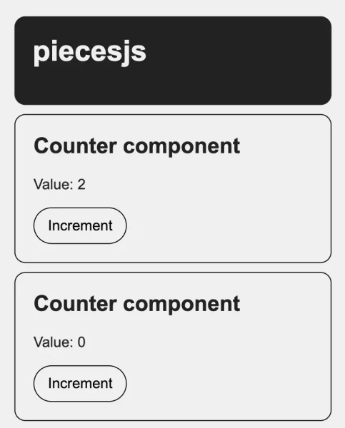
And here is the result:

Next, we’ll make the counter interactive by adding a click event to the button, allowing it to increment the value. To achieve this, you need to add the static get observedAttributes() function to observe changes to the value attribute and trigger a re-render when updates occur.
In Counter.js:
mount() {
  // Query with this.$
  this.$button = this.$('button')[0];

  // Event listener
  this.on('click', this.$button, this.increment);
}

increment() {
  this.value = parseInt(this.value) + 1;
}

unmount() {
  // Always important to remove the listener here
  this.off('click', this.$button, this.increment);
}

// Important to automatically call the update function if attribute is changing
// and to trigger a new render
static get observedAttributes() {
  return ['value'];
}
Tada! 🎉 You’ve successfully created your first reactive Piece!
Reset.js – Communication Between Pieces
Next, we’ll create a Reset Piece to communicate with our counters and reset their values. We’ll add two reset components to the HTML: one to reset all counters, and another to reset only the first counter. To achieve this, we’ll use a counterToReset attribute, assigning it the same value as the cid of the counter we want to reset.
<c-reset class="c-button"> Reset counters </c-reset>
<c-reset class="c-button" counterToReset="firstCounter"> Reset first counter </c-reset>
In your components folder you can create Reset.js:
import { Piece } from 'piecesjs';

class Reset extends Piece {
  constructor() {
    super('Reset');
  }

  mount() {
    // event name, target, function, params (optional)
    this.on('click', this, this.click);
  }

  click(e) {
	  // function name, params, Piece name, cid of the piece (optional)
    this.call('reset', {}, 'Counter', this.counterToReset);
  }

  unmount() {
    this.off('click', this, this.click);
  }

	// getter and setter for easy access to the counterToReset attribute
	// with a "this.counterToReset"
  get counterToReset() {
    return this.getAttribute('counterToReset');
  }

  set counterToReset(value) {
    return this.setAttribute('counterToReset', value);
  }
}

// Register the custom element
customElements.define('c-reset', Reset);
Let’s take a closer look at the click function: The call() method triggers the reset function defined in the Counter.js Piece. The last argument of the call() method is optional and refers to the Piece’s cid. If this argument is omitted, the reset function will be applied to all existing Counter components.
⚠️ Don’t forget to load this new Piece in your app.js.
One more useful method we haven’t covered yet is the emit() method. For example, if you want to dispatch a custom event to notify all Pieces of an action, you can do so within a Piece:
this.emit('something', document, {
  value: 'Something is happened',
});
By default, the event is triggered on the document, but you can also scope it to any specific HTMLElement.
You can then listen for this event from any Piece using the following:
mount() {
	this.on('something', document, this.somethingIsHappened);
}

somethingIsHappened(e) {
	console.log(e.detail) // {value: 'Something is happened'}
}

// and don't forget to remove the event listener
unmount() {
	this.off('something', document, this.somethingIsHappened);
}
That’s it! I hope you enjoyed this first part and that it inspires you to explore further with piecesjs. Up next, we’ll go through a quick implementation of piecesjs with Astro. But before we dive in, here are some useful details:
MEMO: List of Methods, Properties, and Attributes
For a comprehensive list of methods, properties, and attributes available in piecesjs, you can refer to the official documentation:
GitHub: piecesjs Memo
Some Tips for Larger Projects
Page Transitions
If your project involves page transitions, it’s essential to re-trigger your components load() calls. This function scans the updated DOM and initializes any components that haven’t been loaded yet.
load('c-header', () => import('/assets/js/components/Header.js'));To streamline this process, consider putting your load() calls into a utility function that can be called after each page transition, once the new container is in the DOM.
The unmount() function is automatically called when a Piece (or custom element) is removed from the DOM. This means there’s no need to manually check which Pieces need to be unmounted during a page transition. Since piecesjs is built on native web components, this cleanup is handled for you.
Global styles
With piecesjs, you can also include global or shared styles to manage variables, utilities, and more. It’s even possible to import an entire folder with Vite, making it incredibly efficient 🔥
For example, you can create a styles.js file, import it into your HTML, and load the CSS files like this:
// Import a folder
import.meta.glob('../css/settings/*.css', { eager: true });
import.meta.glob('../css/common/*.css', { eager: true });

// Import a file
import '../css/document.css';
Implementation Example with Astro
Now, let’s explore how to integrate what we’ve built with piecesjs into an Astro project. This will primarily involve adjusting the project structure and file paths, but the process is quite straightforward.
To get started, run the following command in your terminal:
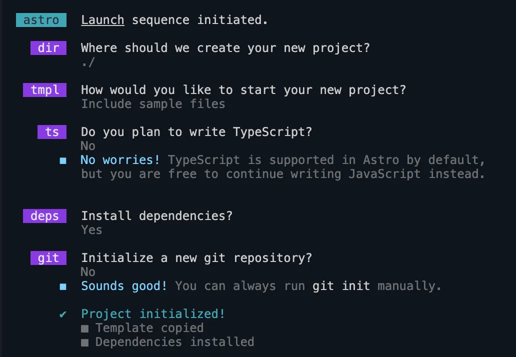
npm create astro@latest
At the second prompt, choose “Include sample files”. Then, select “No” for TypeScript and “Yes” to install dependencies.
After that, you can install piecesjs by running the following command:
npm i piecesjs --saveIn pages/index.astro you can clean up the file and paste our previous code:
---
import Layout from '../layouts/Layout.astro';
---

<Layout title="Welcome to Astro and piecesjs">

    <c-header log class="c-header">
      <h1>piecesjs</h1>
    </c-header>

    <c-counter cid="firstCounter" class="c-counter" value="2"></c-counter>
    <c-counter class="c-counter" value="0"></c-counter>

    <c-reset class="c-button"> Reset counters </c-reset>
    <c-reset class="c-button" counterToReset="firstCounter">Reset first counter</c-reset>

</Layout>
In Layout.astro, you can paste this simple example. For ease of implementation, everything needed to load the pieces and common styles will be included directly in this file:
---
const { title } = Astro.props;
---

<!doctype html>
<html lang="en">
  <head>
    <meta charset="UTF-8" />
    <meta name="description" content="Astro description" />
    <meta name="viewport" content="width=device-width" />
    <link rel="icon" type="image/svg+xml" href="/favicon.svg" />
    <meta name="generator" content={Astro.generator} />
    <title>{title}</title>
  </head>
  <body>
    <slot />

    <script>
      import { load } from 'piecesjs';

      load('c-header', () => import('../components/Header.js'));
      load('c-counter', () => import('../components/Counter.js'));
      load('c-reset', () => import('../components/Reset.js'));

      // Common styles
      // Import a folder
      import.meta.glob('../styles/reset/*.css', { eager: true });
      import.meta.glob('../styles/common/*.css', { eager: true });

      // Import a file
      import '../styles/global.css';
    </script>
  </body>
</html>
Now, place your CSS files and folders in /src/styles and your pieces in /src/components. After that, update the stylesheet paths for each Piece to match the new structure. For example, in Header.js, the path should be updated as follows:
class Header extends Piece {
  constructor() {
    super('Header', {
      stylesheets: [() => import('/src/styles/components/header.css')],
    });
  }
}

// Register the custom element
customElements.define('c-header', Header);
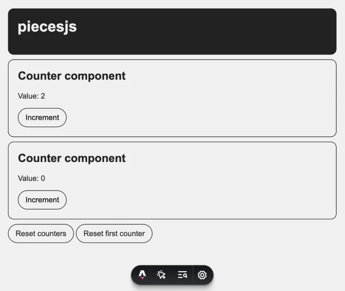
And that’s it! Now you can explore the entire Astro ecosystem with piecesjs and customize it however you like—whether that’s connecting a CMS or anything else you can imagine.

Thank you, and I hope this inspires you to create amazing projects with piecesjs!
