Hey there 👋! I’m Matias, a creative web dev based in Buenos Aires, Argentina. I currently run joyco.studio, and we recently released the first version of our website. It features a comic-like dot grid shader background, and in this post, I’ll show you how it’s coded, breaking it down into 4 simple steps.
But before we begin, I’ll ask you to turn ON the compositional thinking switch. Getting to a complex render is the result of achieving smaller and less complex outputs first, and then blending them all into something interesting. Have a look at what we will be creating:
That being said, let’s start with a base dot grid.
Step 1: The Dot Grid
Our background’s base aesthetic will be a dotted grid pattern, for which we only need a screen quad (full-screen plane geometry) and a custom shader material.
Making a screen quad is super simple since we don’t need any 3D projection calculation, so it’s even simpler than the average vertex shader:
void main() {
    gl_Position = vec4(position.xy, 0.0, 1.0);
}
And here’s the fragment shader:
void main() {
    vec2 screenUv = gl_FragCoord.xy / resolution; // get uvs from pixel coord
    vec2 uv = coverUv(screenUv); // aspect correct

    vec2 gridUv = fract(uv * gridSize);

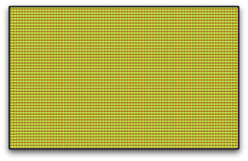
    gl_FragColor = vec4(gridUv.x, gridUv.y, 0.0, 1.0);
}
That’s it; now you have the base grid. Yes, I know—why is it squared? what are those colors? where are my dots?! We’re getting there. They are squared because our shader subdivides the screen coordinates that go from 0 (left) to 1 (right) into smaller chunks controlled by our gridSize uniform. Those colors are UVs for each grid box, basically local coordinates. The color grading is due to uv.x and uv.y being used as the red and green channels, respectively.
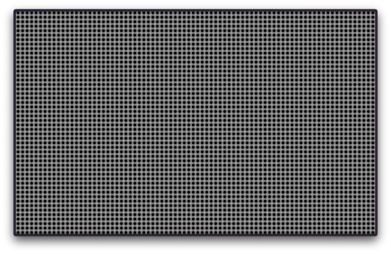
Our last thing to do here is to turn our pointy squares into round dots. We can do that by measuring the distance from the center of each local box; we can achieve it using the sdfCircle(point, radius) function (SDF stands for “Signed Distance Function“). The size of the circle will be determined by the radius—let’s say 0.3 (tweak it yourself and see the result!). Let’s update the fragment code:
//...
float baseDot = sdfCircle(gridUv, radius); // sdfCircle code available on demo below

gl_FragColor = vec4(vec3(baseDot), 1.0);
//...
If the result of the sdfCircle function is less than or equal to zero, then that pixel fragment is considered part of our circle. That’s why our circles are black in the center and as you go further away, they turn white 0 -> ∞. There are a LOT of well-known SDF functions, and Inigo Quilez caught ’em all.
Step 2: The Mouse Trail
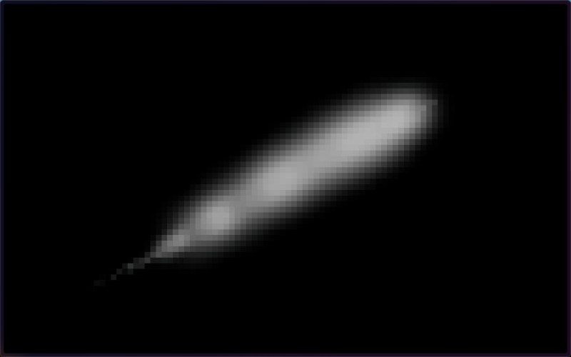
@react-three/drei got us covered here; it has a hook for this. It handles the creation of a 2D canvas and drawing to it based on the onPointerMove event. The event.uv tells where the mouse intersection was. Check the source code here.
If it doesn’t start right away, click and move the mouse.
This is just perfect! Later, we’ll sample this mouse trail texture to highlight the dots that are being hovered. But we won’t do it the “easy” way, which would be using the dots as a mask over the trail texture. It’s not bad, but that would render the underlying trail texture gradient inside the circles. Instead, I want each circle to be color uniform, and we can achieve that by sampling the trail texture from the center of each grid box (which is the center of our dots too). See? It’s essentially a pixelation effect.

Step 3: The Mask
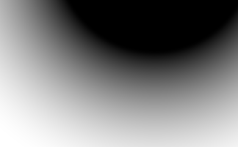
The first is a radial gradient at y: 110% and x: 0.7 from the bottom-left.

A linear gradient from the screen top to the screen bottom.

And a time-based animated radial gradient with the center at the same point as the first one.
We’ll only blend the first two, and the animated one will be used later. Here’s the code:
float circleMaskCenter = length(uv - vec2(0.70, 1.0));
float circleMask = smoothstep(0.4, 1.0, circleMaskCenter);
float circleAnimatedMask = sin(time * 2.0 + circleMaskCenter * 10.0);

float screenMask = smoothstep(0.0, 1.0, 1.0 - uv.y);

// Blend
float combinedMask = screenMask * circleMask;
Step 4: The Composition
Yes! Started from the bottom, now we are here! We made it to our last step: blending it all together.
Let’s pick special colors for this special post (my first one in codrops 🥳) I’ll use #FF5001 and #FFF for the background and dots respectively. The fun part is that we are free to tweak how each composition step interacts with each other. Eg, how much opacity adds the mouse trail to the dots? Should it scale them too? Can it also change their colors?! My answer here is “Follow your heart“. I made my choices for this demo but feel free to tweak them.
The dot scale and opacity are affected by the mouseTrail, combinedMask, and circleAnimatedMask.
// The mouse trail is a B&W image, we only need the red channel.
float mouseInfluence = texture2D(mouseTrail, gridUvCenterInScreenCoords).r;

float scaleInfluence = max(mouseInfluence * 0.5, circleAnimatedMask * 0.3);
float opacityInfluence = max(mouseInfluence * 15.0, circleAnimatedMask * 0.5);

float sdfDot = sdfCircle(gridUv, dotSize * (1.0 + scaleInfluence * 0.5));
float smoothDot = smoothstep(0.05, 0.0, sdfDot); // Smooth the edges

vec3 composition = mix(bgColor, dotColor, smoothDot * combinedMask * dotOpacity * (1.0 + opacityInfluence));

gl_FragColor = vec4(composition, 1.0);
As our last act, we should apply tone mapping and adjust the output to the renderer’s color space; otherwise, our colors won’t display accurately. Before our shader gets compiled, threejs imports its internal lib chunks of code if it finds an #include <{chunk_name}> snippet in the shader. We can borrow the tonemapping_fragment and colorspace_fragment from there. Here’s the code:
#include <tonemapping_fragment>
#include <colorspace_fragment>
FYI: There’s a whole library of shader chunks available in threejs check ’em out. It might save you some time in the future!
That’s it for this post! I hope you enjoyed diving into the creative process behind building a custom shader-powered dot grid and learning some new tricks along the way.
Thanks for following along, and don’t forget to eat your vegetables! See you around on X!
