Image by Author
Outliers are abnormal observations that differ significantly from the rest of your data. They may occur due to experimentation error, measurement error, or simply that variability is present within the data itself. These outliers can severely impact your model’s performance, leading to biased results – much like how a top performer in relative grading at universities can raise the average and affect the grading criteria. Handling outliers is a crucial part of the data cleaning procedure.
In this article, I’ll share how you can spot outliers and different ways to deal with them in your dataset.
Detecting Outliers
There are several methods used to detect outliers. If I were to classify them, here is how it looks:
- Visualization-Based Methods: Plotting scatter plots or box plots to see data distribution and inspect it for abnormal data points.
- Statistics-Based Methods: These approaches involve z scores and IQR (Interquartile Range) which offer reliability but may be less intuitive.
I won’t cover these methods extensively to stay focused, on the topic. However, I’ll include some references at the end, for exploration. We will use the IQR method in our example. Here is how this method works:
IQR (Interquartile Range) = Q3 (75th percentile) – Q1 (25th percentile)
The IQR method states that any data points below Q1 – 1.5 * IQR or above Q3 + 1.5 * IQR are marked as outliers. Let’s generate some random data points and detect the outliers using this method.
Make the necessary imports and generate the random data using np.random:
import pandas as pd
import numpy as np
import matplotlib.pyplot as plt
import seaborn as sns

# Generate random data
np.random.seed(42)
data = pd.DataFrame({
    'value': np.random.normal(0, 1, 1000)
})
Detect the outliers from the dataset using the IQR Method:
# Function to detect outliers using IQR
def detect_outliers_iqr(data):
    Q1 = data.quantile(0.25)
    Q3 = data.quantile(0.75)
    IQR = Q3 - Q1
    lower_bound = Q1 - 1.5 * IQR
    upper_bound = Q3 + 1.5 * IQR
    return (data  upper_bound)

# Detect outliers
outliers = detect_outliers_iqr(data['value'])

print(f"Number of outliers detected: {sum(outliers)}")
Output ⇒ Number of outliers detected: 8
Visualize the dataset using scatter and box plots to see how it looks
# Visualize the data with outliers using scatter plot and box plot
fig, (ax1, ax2) = plt.subplots(1, 2, figsize=(15, 6))

# Scatter plot
ax1.scatter(range(len(data)), data['value'], c=['blue' if not x else 'red' for x in outliers])
ax1.set_title('Dataset with Outliers Highlighted (Scatter Plot)')
ax1.set_xlabel('Index')
ax1.set_ylabel('Value')

# Box plot
sns.boxplot(x=data['value'], ax=ax2)
ax2.set_title('Dataset with Outliers (Box Plot)')
ax2.set_xlabel('Value')

plt.tight_layout()
plt.show()
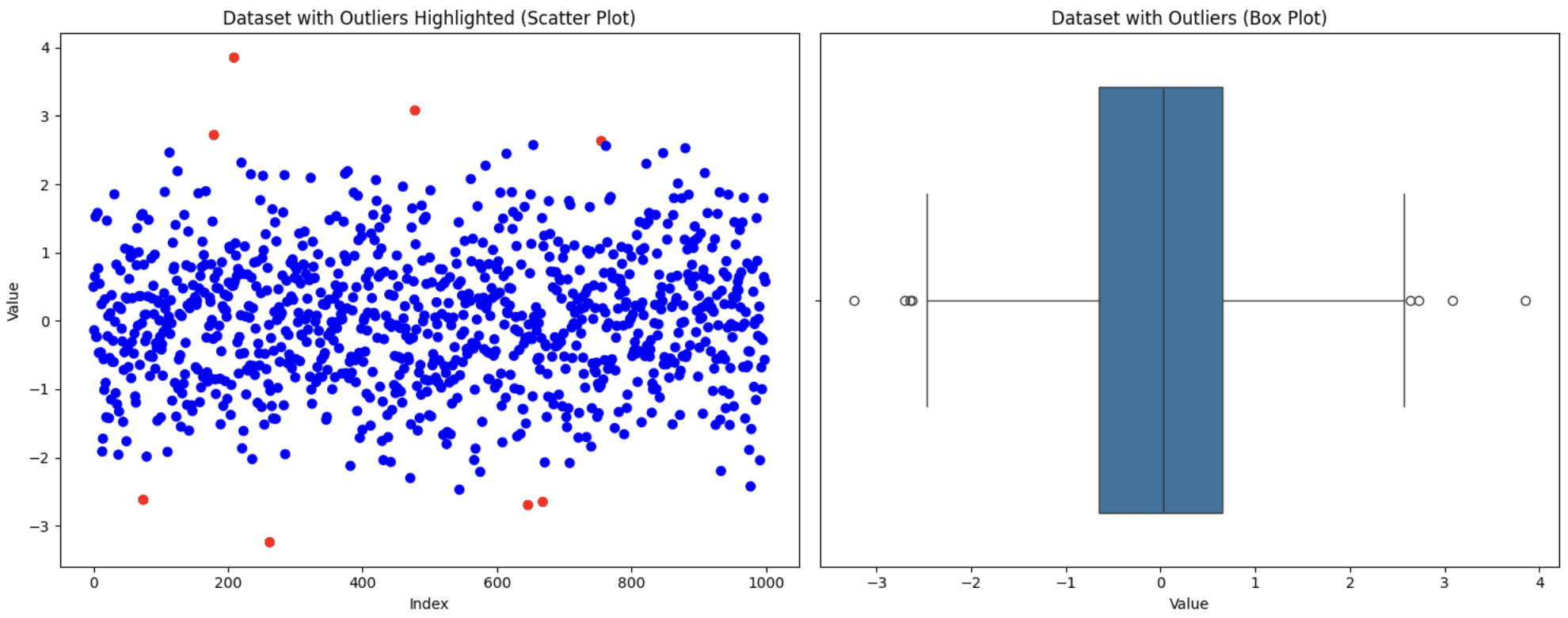

Original Dataset
Now that we have detected the outliers, let’s discuss some of the different ways to handle the outliers.
Handling Outliers
1. Removing Outliers
This is one of the simplest approaches but not always the right one. You need to consider certain factors. If removing these outliers significantly reduces your dataset size or if they hold valuable insights, then excluding them from your analysis not be the most favorable decision. However, if they’re due to measurement errors and few in number, then this approach is suitable. Let’s apply this technique to the dataset generated above:
# Remove outliers
data_cleaned = data[~outliers]

print(f"Original dataset size: {len(data)}")
print(f"Cleaned dataset size: {len(data_cleaned)}")

fig, (ax1, ax2) = plt.subplots(1, 2, figsize=(15, 6))

# Scatter plot
ax1.scatter(range(len(data_cleaned)), data_cleaned['value'])
ax1.set_title('Dataset After Removing Outliers (Scatter Plot)')
ax1.set_xlabel('Index')
ax1.set_ylabel('Value')

# Box plot
sns.boxplot(x=data_cleaned['value'], ax=ax2)
ax2.set_title('Dataset After Removing Outliers (Box Plot)')
ax2.set_xlabel('Value')

plt.tight_layout()
plt.show()
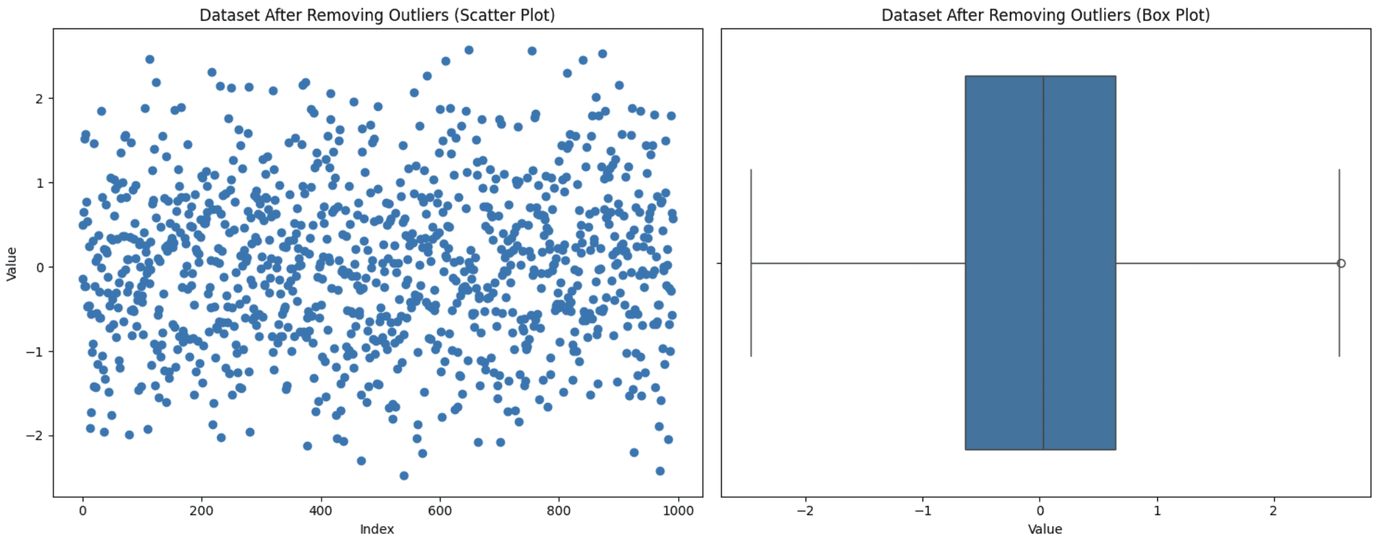

Removing Outliers
Notice that the distribution of the data can actually be changed by removing outliers. If you remove some initial outliers, the definition of what is an outlier may very well change. Therefore, data that would have been in the normal range before, may be considered outliers under a new distribution. You can see a new outlier with the new box plot.
2. Capping Outliers
This technique is used when you do not want to discard your data points but keeping those extreme values can also impact your analysis. So, you set a threshold for the maximum and the minimum values and then bring the outliers within this range. You can apply this capping to outliers or to your dataset as a whole too. Let’s apply the capping strategy to our complete dataset to bring it within the range of the 5th-95th percentile. Here is how you can execute this:
def cap_outliers(data, lower_percentile=5, upper_percentile=95):
    lower_limit = np.percentile(data, lower_percentile)
    upper_limit = np.percentile(data, upper_percentile)
    return np.clip(data, lower_limit, upper_limit)

data['value_capped'] = cap_outliers(data['value'])

fig, (ax1, ax2) = plt.subplots(1, 2, figsize=(15, 6))

# Scatter plot
ax1.scatter(range(len(data)), data['value_capped'])
ax1.set_title('Dataset After Capping Outliers (Scatter Plot)')
ax1.set_xlabel('Index')
ax1.set_ylabel('Value')

# Box plot
sns.boxplot(x=data['value_capped'], ax=ax2)
ax2.set_title('Dataset After Capping Outliers (Box Plot)')
ax2.set_xlabel('Value')

plt.tight_layout()
plt.show()
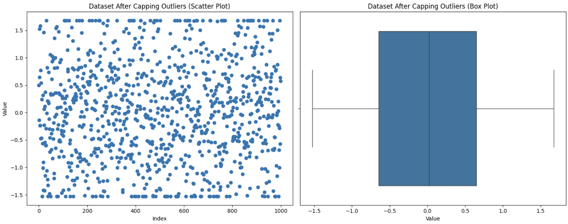

Capping Outliers
You can see from the graph that the upper and lower points in the scatter plot appear to be in a line due to capping.
3. Imputing Outliers
Sometimes removing values from the analysis isn’t an option as it may lead to information loss, and you also don’t want those values to be set to max or min like in capping. In this situation, another approach is to substitute these values with more meaningful options like mean, median, or mode. The choice varies depending on the domain of data under observation, but be mindful of not introducing biases while using this technique. Let’s replace our outliers with the mode (the most frequently occurring value) value and see how the graph turns out:
data['value_imputed'] = data['value'].copy()
median_value = data['value'].median()
data.loc[outliers, 'value_imputed'] = median_value

fig, (ax1, ax2) = plt.subplots(1, 2, figsize=(15, 6))

# Scatter plot
ax1.scatter(range(len(data)), data['value_imputed'])
ax1.set_title('Dataset After Imputing Outliers (Scatter Plot)')
ax1.set_xlabel('Index')
ax1.set_ylabel('Value')

# Box plot
sns.boxplot(x=data['value_imputed'], ax=ax2)
ax2.set_title('Dataset After Imputing Outliers (Box Plot)')
ax2.set_xlabel('Value')

plt.tight_layout()
plt.show()
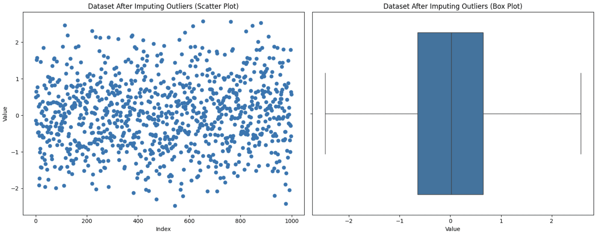

Imputing Outliers
Notice that now we don’t have any outliers, but this doesn’t guarantee that outliers will be removed since after the imputation, the IQR also changes. You need to experiment to see what fits best for your case.
4. Applying a Transformation
Transformation is applied to your complete dataset instead of specific outliers. You basically change the way your data is represented to reduce the impact of the outliers. There are several transformation techniques like log transformation, square root transformation, box-cox transformation, Z-scaling, Yeo-Johnson transformation, min-max scaling, etc. Choosing the right transformation for your case depends on the nature of the data and your end goal of the analysis. Here are a few tips to help you select the right transformation technique:
- For right-skewed data: Use log, square root, or Box-Cox transformation. Log is even better when you want to compress small number values that are spread over a large scale. Square root is better when, apart from right skew, you want a less extreme transformation and also want to handle zero values, while Box-Cox also normalizes your data, which the other two don’t.
- For left-skewed data: Reflect the data first and then apply the techniques mentioned for right-skewed data.
- To stabilize variance: Use Box-Cox or Yeo-Johnson (similar to Box-Cox but handles zero and negative values as well).
- For mean-centering and scaling: Use z-score standardization (standard deviation = 1).
- For range-bound scaling (fixed range i.e., [2,5]): Use min-max scaling.
Let’s generate a right-skewed dataset and apply the log transformation to the complete data to see how this works:
import pandas as pd
import numpy as np
import matplotlib.pyplot as plt
import seaborn as sns

# Generate right-skewed data
np.random.seed(42)
data = np.random.exponential(scale=2, size=1000)
df = pd.DataFrame(data, columns=['value'])

# Apply Log Transformation (shifted to avoid log(0))
df['log_value'] = np.log1p(df['value'])

fig, axes = plt.subplots(2, 2, figsize=(15, 10))

# Original Data - Scatter Plot
axes[0, 0].scatter(range(len(df)), df['value'], alpha=0.5)
axes[0, 0].set_title('Original Data (Scatter Plot)')
axes[0, 0].set_xlabel('Index')
axes[0, 0].set_ylabel('Value')

# Original Data - Box Plot
sns.boxplot(x=df['value'], ax=axes[0, 1])
axes[0, 1].set_title('Original Data (Box Plot)')
axes[0, 1].set_xlabel('Value')

# Log Transformed Data - Scatter Plot
axes[1, 0].scatter(range(len(df)), df['log_value'], alpha=0.5)
axes[1, 0].set_title('Log Transformed Data (Scatter Plot)')
axes[1, 0].set_xlabel('Index')
axes[1, 0].set_ylabel('Log(Value)')

# Log Transformed Data - Box Plot
sns.boxplot(x=df['log_value'], ax=axes[1, 1])
axes[1, 1].set_title('Log Transformed Data (Box Plot)')
axes[1, 1].set_xlabel('Log(Value)')

plt.tight_layout()
plt.show()


Applying Log Transformation
You can see that a simple transformation has handled most of the outliers itself and reduced them to just one. This shows the power of transformation in handling outliers. In this case, it’s necessary to be cautious and know your data well enough to choose appropriate transformation because failing to do so may cause problems for you.
Wrapping Up
This brings us to the end of our discussion about outliers, different ways to detect them, and how to handle them. This article is part of the pandas series, and you can check other articles on my author page. As mentioned above, here are some additional resources for you to study more about outliers:
- Outlier detection methods in Machine Learning
- Different transformations in Machine Learning
- Types Of Transformations For Better Normal Distribution
Kanwal Mehreen Kanwal is a machine learning engineer and a technical writer with a profound passion for data science and the intersection of AI with medicine. She co-authored the ebook “Maximizing Productivity with ChatGPT”. As a Google Generation Scholar 2022 for APAC, she champions diversity and academic excellence. She’s also recognized as a Teradata Diversity in Tech Scholar, Mitacs Globalink Research Scholar, and Harvard WeCode Scholar. Kanwal is an ardent advocate for change, having founded FEMCodes to empower women in STEM fields.
