
Image by Editor
ggplot2 is a tool in R for making charts. You can create charts with dots, bars, or lines. You can also add layers to show more details. This article will help you learn how to use ggplot2 to create visualizations.
Getting started with ggplot2
Before using ggplot2, you need to install it and load the package:
install.packages("ggplot2")
library(ggplot2)
Create Basic Plots with ggplot2
Let’s explore some basic plots in R.
Scatter Plot
A scatter plot shows how two variables are connected. Each dot represents one set of values from those variables. It’s useful for spotting trends, patterns, and outliers.
ggplot(data = mtcars, aes(x = wt, y = mpg)) +
  geom_point(color = "blue") +
  labs(title = "Relationship Between Weight and MPG",
       x = "Weight (1000 lbs)",
       y = "Miles Per Gallon (MPG)")

This plot shows the relationship between car weight and miles per gallon (MPG). It uses blue dots to represent each car in the dataset.
Line Plot
A line plot displays data points connected by lines. It’s great for showing changes over time. Each point represents a value at a specific time, and the lines help see trends and patterns.
ggplot(data = economics, aes(x = date, y = unemploy)) +
  geom_line(color = "blue") +
  labs(title = "Unemployment Over Time",
       x = "Date",
       y = "Number of Unemployed (in thousands)")
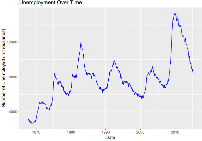
This plot shows unemployment trends over time. It employs a blue line to link the data points.
Bar Plot
A bar plot uses rectangular bars to show the size of different categories. Each bar in the chart stands for a unique category. Its height indicates the corresponding value. Bar plots are useful for comparing sizes across categories.
ggplot(data = mtcars, aes(x = factor(cyl))) +
  geom_bar(fill = "blue", color = "black", width = 0.5) +
  labs(title = "Distribution of Cars by Cylinder Count",
       x = "Number of Cylinders",
       y = "Count of Cars")

This bar plot shows the distribution of cars by cylinder count. Bars are colored blue with black borders. The width of each bar is 0.5.
Advanced Visualizations with ggplot2
Once you’re comfortable with the basics, you can explore more advanced visualizations:
Box Plot
A box plot displays the distribution of data through quartiles. It shows quartiles, and outliers. Box plots help identify the spread and any unusual values in the data.
ggplot(data = mtcars, aes(x = factor(cyl), y = mpg)) +
  geom_boxplot(fill = "lightblue", color = "darkblue", outlier.color = "red", outlier.shape = 16, outlier.size = 2) +
  labs(title = "MPG Distribution by Cylinder Count",
       x = "Number of Cylinders",
       y = "Miles Per Gallon (MPG)")

This box plot displays the distribution of miles per gallon (MPG) for different cylinder counts. The boxes are shaded in light blue and have a dark blue border. Outliers are marked in red. They have a shape of 16 and a size of 2.
Histogram
A histogram divides the data into bins and displays how many data points fall into each bin. The height of each bar indicates the number of data points within that range. Histograms help visualize patterns in the data.
ggplot(data = mtcars, aes(x = mpg)) +
  geom_histogram(binwidth = 2, fill = "blue", color = "black", size = 0.5) +
  labs(title = "Distribution of Miles Per Gallon (MPG)",
       x = "Miles Per Gallon (MPG)",
       y = "Frequency")
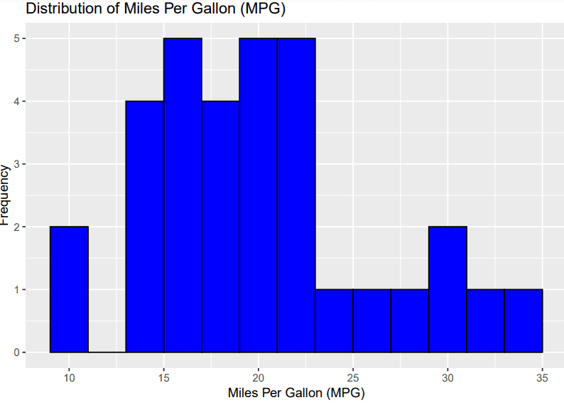
This histogram shows the distribution of miles per gallon (MPG) in the mtcars dataset. The bars are filled with blue and outlined in black. The width of each bin is set to 2.
Density Plot
A density plot shows the distribution of a continuous variable in a smooth curve. The curve’s height indicates the density of data points in different areas. Density plots help visualize the shape and spread of the data.
ggplot(data = mtcars, aes(x = mpg)) +
  geom_density(fill = "lightblue", color = "blue", alpha = 0.5) +
  labs(title = "Density Plot of Miles Per Gallon (mpg)",
       x = "Miles Per Gallon (mpg)",
       y = "Density")

This density plot shows the distribution of miles per gallon (MPG) in the mtcars dataset. The area under the curve is filled with light blue and the curve itself is outlined in blue. The transparency of the fill is set to 50%.
Save Your ggplot2 Plots
After creating your plot, you might want to save it to a file. Use the ggsave() function to save your plots in various formats like PNG, PDF, or SVG.
ggsave("scatter_plot.png")
Conclusion
ggplot2 helps you create different types of charts to display your data. Begin with basic plots and then try more complex ones as you get used to it. You can learn more about ggplot2 at this website.
Jayita Gulati is a machine learning enthusiast and technical writer driven by her passion for building machine learning models. She holds a Master’s degree in Computer Science from the University of Liverpool.
Our Top 3 Course Recommendations
![]()
![]() 1. Google Cybersecurity Certificate – Get on the fast track to a career in cybersecurity.
1. Google Cybersecurity Certificate – Get on the fast track to a career in cybersecurity.
![]()
![]() 2. Google Data Analytics Professional Certificate – Up your data analytics game
2. Google Data Analytics Professional Certificate – Up your data analytics game
![]()
![]() 3. Google IT Support Professional Certificate – Support your organization in IT
3. Google IT Support Professional Certificate – Support your organization in IT