
Nite Riot isn’t just one person, it’s a powerhouse team of creatives crafting
high-voltage promos and commercials for the biggest names in music, fashion,
and entertainment. The kind of work that makes your jaw drop and your brain
scream, “Damn, that’s cool”! So, when we got the chance to build their digital
playground, we knew one thing: it had to hit just as hard as their portfolio.
It just so happened that while working on this project, I was deep into
Louis Paquet’s Awwwards masterclass,
Memorable UI Design For Interactive Experiences. I challenged myself to apply a whole new approach:
“Big Idea”. It became the driving force behind everything
that followed.
Less Noise, More Punch
Nite Riot’s work hits like a lightning bolt—loud, bold, and impossible to
ignore. The website needed to do the opposite: create space for that energy to
shine. We stripped away the noise and leaned into a minimal black-and-white
aesthetic, relying on a dynamic grid layout and a Difference (Blend) Mode to
do the heavy lifting.
entire project together.
We went through multiple visual directions at the start: concepts were
sketched, tested, and tossed. Only the strongest ideas made the cut, forming a
clean yet bold design system.
testing, and scrapping.
Only the boldest ideas survived, forming the
foundation of a clean yet punchy design system.
And we didn’t wait for the homepage to make a first impression. The preloader
set the tone from the jump—not just functional, but atmospheric. It’s the
handshake, the deep breath before the plunge. I always think of the preloader
as the overture of the experience.
killer projects.
Big Idea
My guiding light? Difference Mode. It didn’t just influence the design; it
became the heartbeat of the entire site.
- Typography treatments
- Imagery overlays
- Video hovers
- Case study rollovers
- Page transitions
- Scroll effects
- The logo itself
- Dark/Light theme toggling
- Drag scroll on the Inspired page
- Even the 404 page
Enter the Difference Mode
The goal wasn’t simply to layer on visual effects; instead, it was about
crafting a rhythm. Difference Mode brought contrast and edge to every element
it touched. Hover states, transitions, and page reveals all flowed together,
each following the same beat.
But the impact wasn’t confined to the visual side. On the technical front,
Difference Mode allowed us to create a smooth dark/light theme experience
without the need for redundant styles. With a single toggle, the entire color
palette reversed seamlessly, ensuring both sharpness and performance.
without wrecking the minimalism.
Design Index Page
We experimented with multiple layouts to strike the perfect balance. The
client didn’t want a fullscreen visual overload, but at the same time, they
wanted a strong presence of imagery—all within a minimalist aesthetic. The
result? A carefully structured design that offers a rich visual experience
without overwhelming the user, maintaining the sleek and intentional feel of
the site.
click through with arrows, or grab the timeline and drag your way forward.
Case Study: A Scrolling Cinematic Experience
Case studies aren’t just pages on this site—they’re a journey. Forget the
standard click-and-load experience; here, case studies unfold like a film
reel, one seamless story rolling into the next.
-
On desktop, the layout moves horizontally—because why
should scrolling always be up and down? -
No matter if a title is one line or three, we made sure everything adapts
beautifully. -
We developed a multi-case format, so you’re never locked
into just one story. -
And the showstopper?
The ultra-smooth case study transition. Instead of abruptly
ending one project and making you manually start the next, we designed a
flow where the next case subtly appears, teasing you into it. You can either
click and dive in or keep scrolling, and like magic, you’re onto the next
visual masterpiece.
engaging.
Inspired? You Will Be.
Our favorite part? The Inspired page. Imagine a canvas where images float,
shift, and react to your every move. Drag, drop, hold—boom, Difference Mode
kicks in. It’s a playground for the restless creative mind, where inspiration
isn’t just consumed—it’s interacted with.
404, But Make It Rockstar
Most 404 pages are where fun goes to die. Not here. Ours is a full-blown
experience—an Easter egg waiting to be discovered. The kind of 404 that makes
you want to get lost on purpose.
Oh, and did we mention? We applied
double Difference Mode here. Because why not?
I accidentally duplicated a video layer that had Difference Mode on—and turns
out, the number shapes had the same mode. That happy accident created a unique
setup with a ton of character. And the best part? It was insanely easy to
build in Webflow with just the native tools.
the magic happens.
Animation
Most 404 pages are where fun goes to die. Not here. Ours is a full-blown
experience—an Easter egg waiting to be discovered. The kind of 404 that makes
you want to get lost on purpose.
motion before bringing it to life.
Every animation began in Figma. Once we nailed the tone and pacing, I moved it
all into After Effects, tweaking easings and timings to hit that sweet spot
between smooth and snappy.
about that perfect motion feel.
I leaned on three key easing patterns to shape the site’s movement:
easeSlowStartFastEnd
cubic-bezier(0.2, 0, 0.1, 1)

easeFastStartSmoothEnd
cubic-bezier(0.75, 0, 0, 1)

easeHeadings
cubic-bezier(0.75, 0, 0, 0.35)
When it came to development, GSAP gave us the
control and nuance to bring those animations to life on the web.
Development Choices
We didn’t have an unlimited budget, but we had a clear vision. So we chose
tools that gave us flexibility without compromising on polish.
We pushed Webflow and
GSAP to their limits to bring this vision to
life—fully custom interactions, smooth performance, and pixel-perfect
precision across all devices. Every scroll, hover, and transition was
carefully crafted to support the story.
Stack Under the Hood:
- Webflow: our base platform
- GSAP: the animation engine
- Barba.js: for seamless page transitions
-
Embla.js: smooth slider on
the homepage -
Lenis: buttery custom
scroll experience -
Glightbox: for
full-screen video playback
Barba.js and Lenis worked perfectly together for our infinite scroll effect
and horizontal case study navigation.
Tech Breakdown: From Stack to Story
Global
-
Page transitions powered by barba.js +
GSAP, including smooth element reveals on entry.
Index Page
-
Case slider built with Embla Carousel for
the title timeline and mobile image switching. -
GSAP handles pagination animations and desktop image
transitions.
Inspired Page
-
Drag-to-explore canvas with floating images and color
inversion using vanilla JS + CSS.als on
entry.
Work Page
-
List item hover effects with highlight and background
transitions using JS + CSS + GSAP.
About Page
-
Section overlap animation with background scaling and
masked reveals powered by CSS + GSAP. -
On-scroll reveal of text and imagery using
GSAP ScrollTrigger. -
Hover animations on cities (desktop) +
auto image rotation (mobile) via
JS + GSAP. - Smooth scrolling handled by lenis.js.
Case Studies
-
Horizontal scroll experience using
lenis.js + GSAP. -
Pagination updates animated with
JS + GSAP. -
Parallax effects on H1, media, and next-case blocks powered
by GSAP. - Tab transitions via barba.js + GSAP.
-
Scroll-based transition to the next case using
JS + barba.js + GSAP. -
Back button transition animated with
JS + barba.js + GSAP. -
Full-screen video block with smooth entry/exit animations
using JS + GSAP + glightbox.
404 Page
- Scrolling text ticker via CSS animations.
-
Cursor-following 404 block on desktop using
JS + GSAP. -
Chaotic digit displacement animated with
GSAP. -
Motion-reactive number shift on mobile/tablet via
JS + Device Orientation API.
Visual Optimization
Performance mattered—especially on case study pages packed with video previews
and hi-res imagery. Our toolchain:
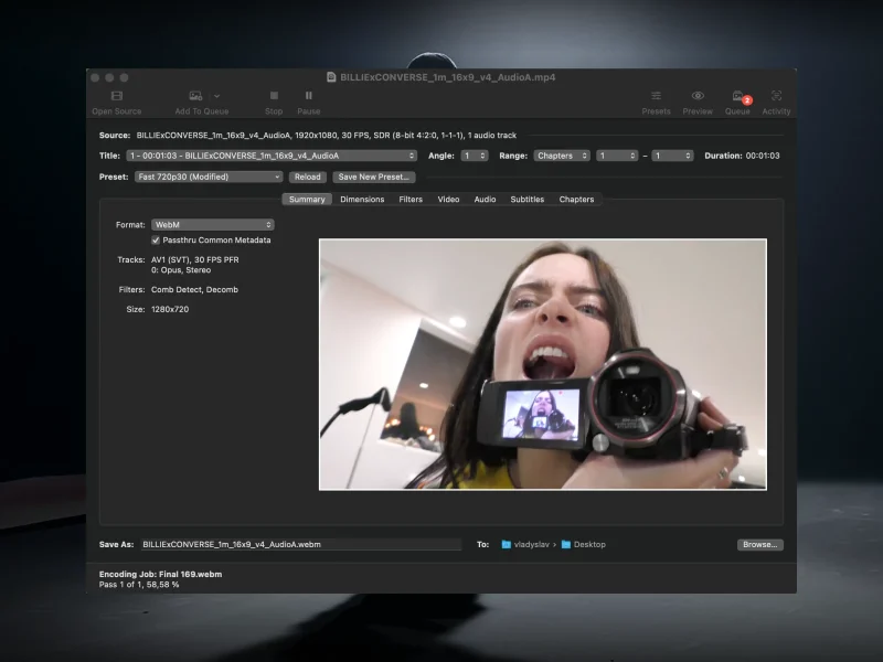
- Handbrake for compressing videos
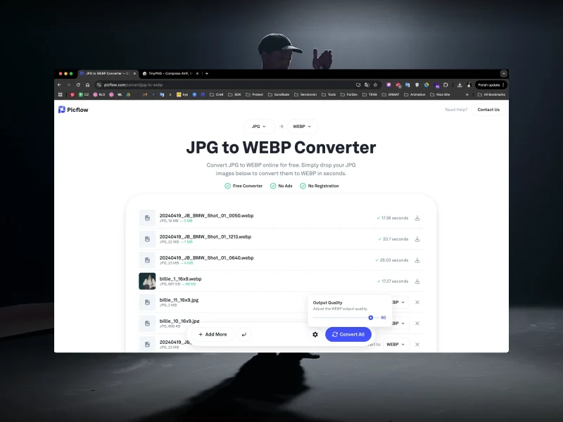
- Picflow for bulk image optimization
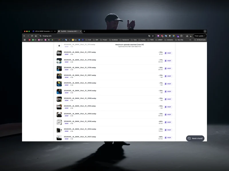
- tinypng for WebP polishing
Picflow let us handle massive batches of photos way faster than Squoosh ever
could. Big time-saver.
CMS
We built everything in Webflow’s CMS. Super clean and fast to update. Adding a
new case is as easy as filling out a form.
Not Just a Portfolio. A Vibe.
This wasn’t about making another nice-looking site. It was about building a
space that feels alive. Every pixel, every transition, every weird, wonderful
interaction was designed to make people feel something. Minimalism with an
edge. Order with a dash of chaos. Just like Nite Riot.
Oh, and speaking of hidden gems—let’s just say we have a soft spot for Easter
eggs. If you hover over the Nite Riot logo, you might just stumble upon a
couple of surprises. No spoilers, though. You’ll have to find them yourself.
😉
Click. Explore. Get Lost.
This is not just a website. It’s an experience. A digital world built to be
played with. So go ahead—dive in, mess around, and see what happens!
Visit the Nite Riot Site
Credits
Creation Direction:
BL/S®
Art / Creative Director:
Serhii Polyvanyi
UI / UX Design:
Vladyslav Litovka
PM: Julia Nikitenko
Dev Direction: V&M, Yevhenii Prykhodko